


WWW
This website is an onging experimentation with code as medium, digital ephemera, and the beauty of design contraints.
APOHL.XYZ is a visual journal first, and a portfolio second.
Instructions for navigating APOHL.XYZ:
Click on labels to reveal content. A pink dot signifies a research focused project. A green dot signifies a studio practice project. A blue dot signifies an experimental project. Hold shift and scroll to view multi-image sliders. Each corner icon corresponds to a different page. Explore APOHL.XYZ for easter eggs and interactivity.
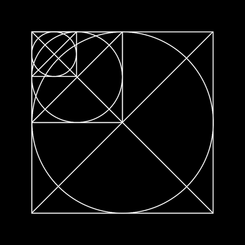
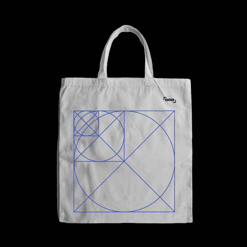
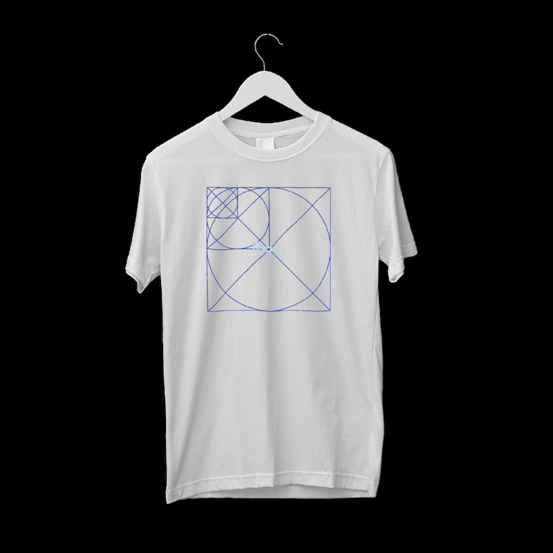
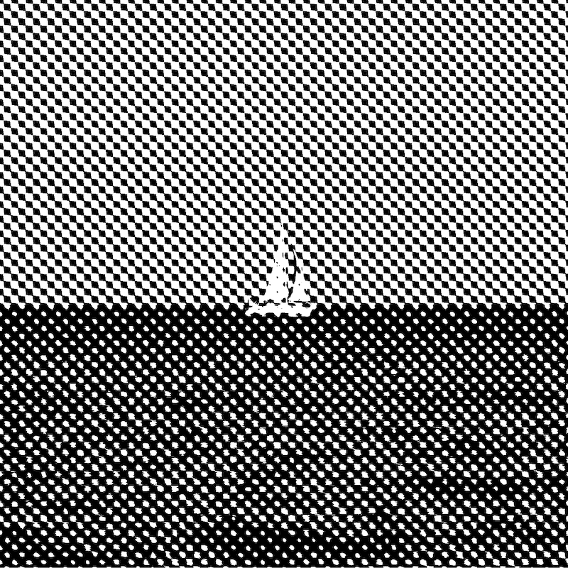
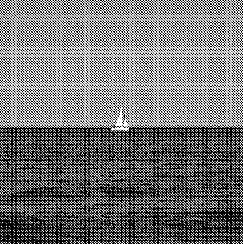
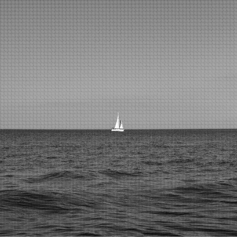
#WWW


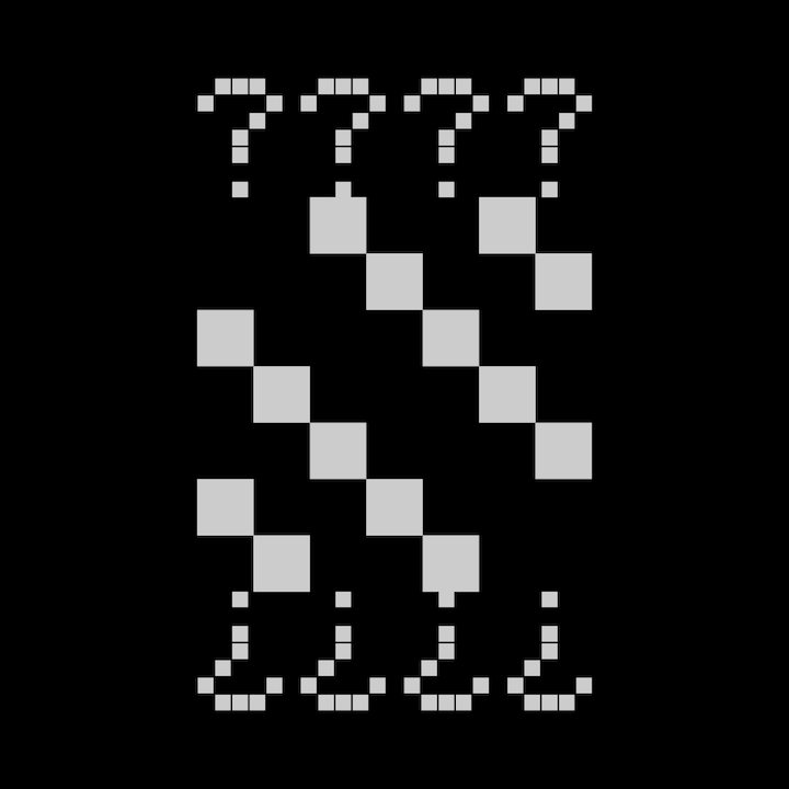
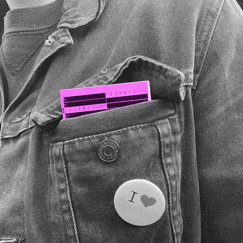
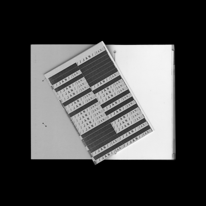
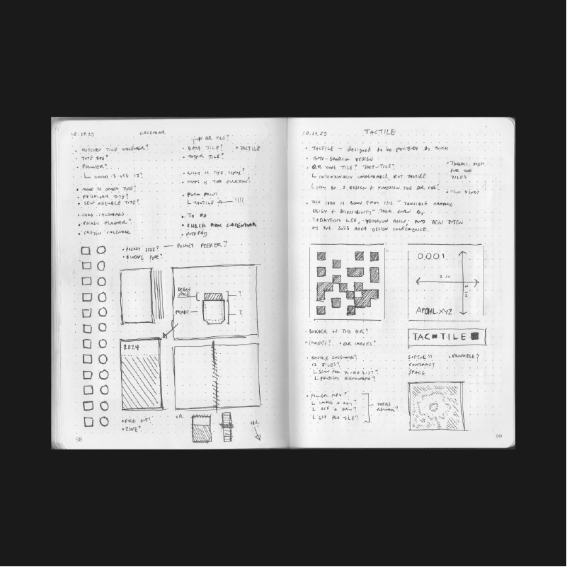
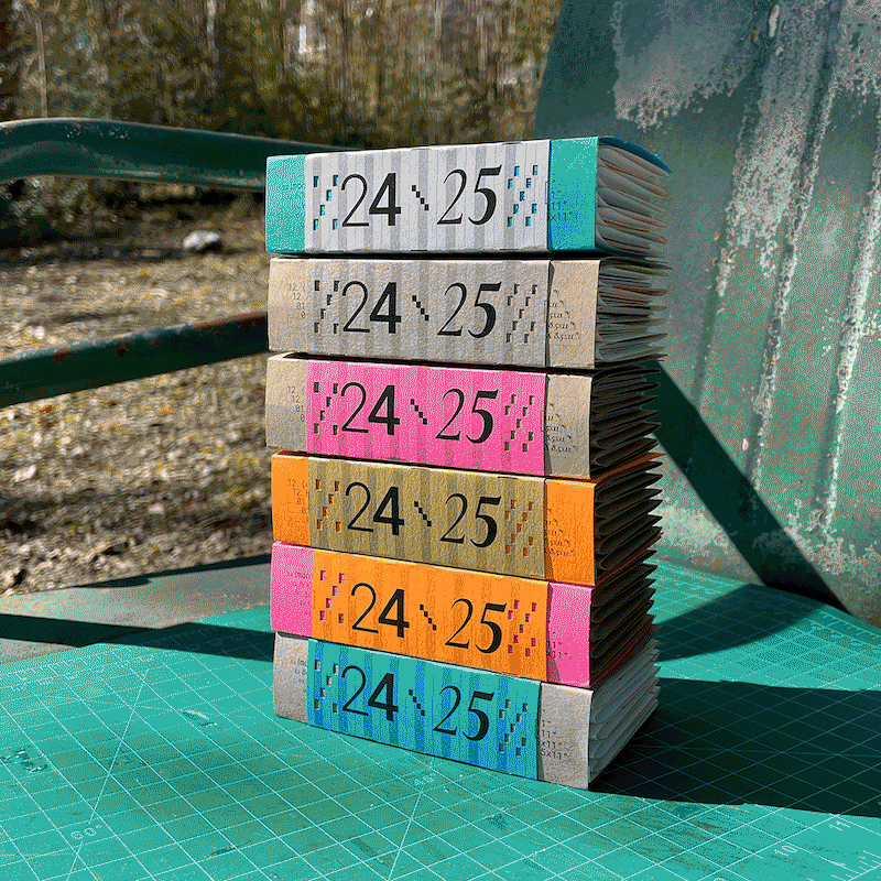
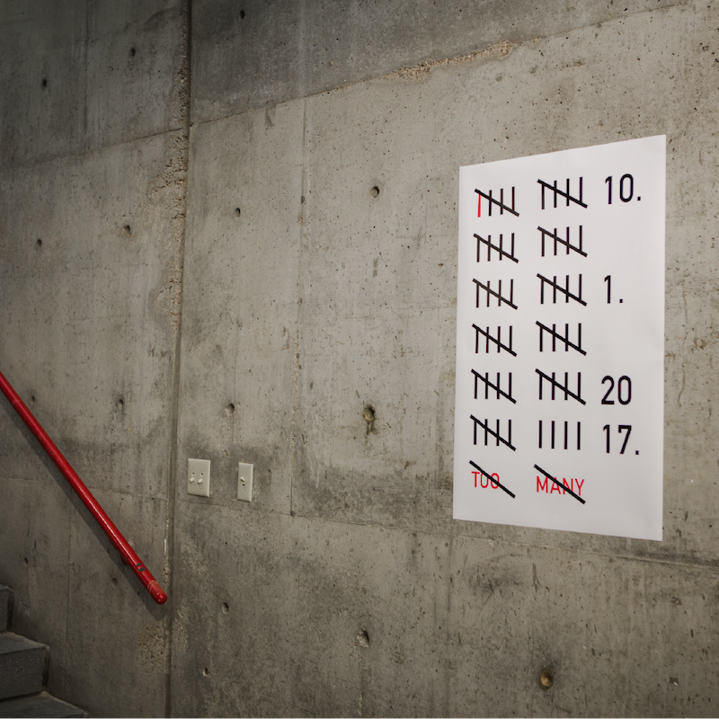
"CALENDAR"
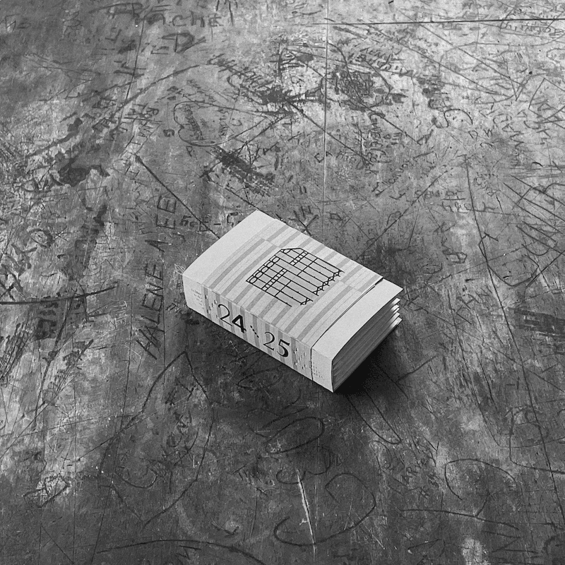
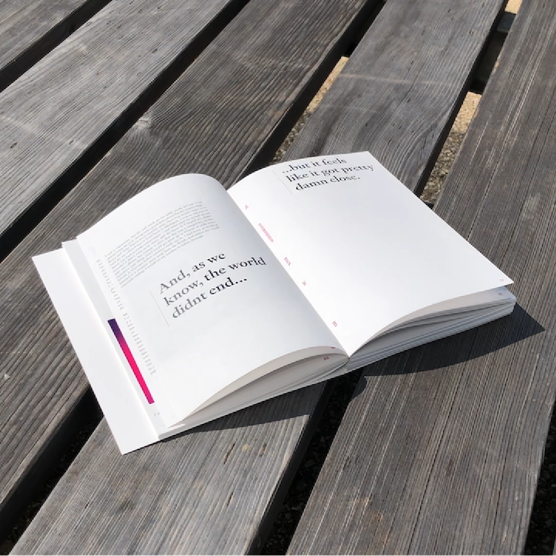
2024 DIY "calendar" / WIP
OPEN_SOURCE_HOW_TO_MANUAL
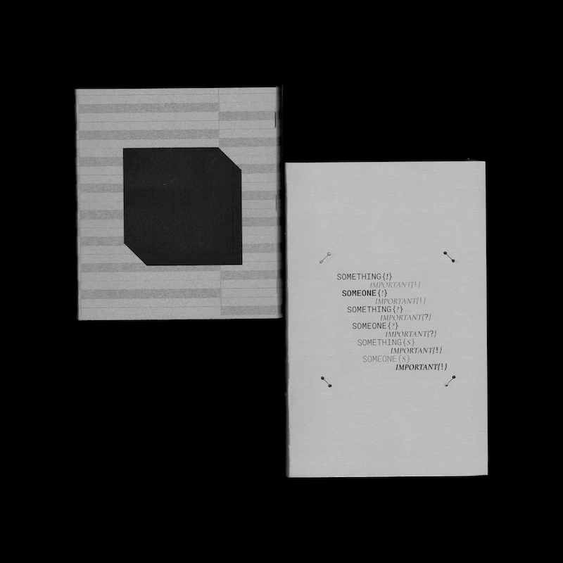
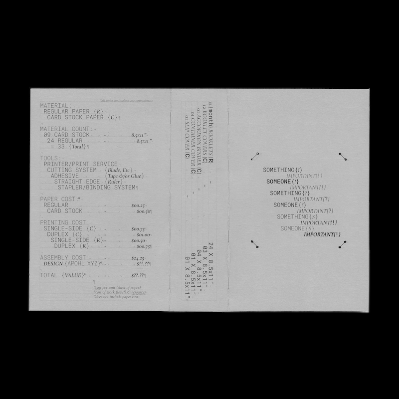
This calendar is designed to be as modular, open-source, accessible, and DIY as possible. Inspired by the need to get things done, and the will or lack thereof to do so, the process for this "calendar" became an intense, emotional, and reflective one over the course of several months in the year of 2023, and the beginning of 2024. In the end, the design functioned as a response to a personal need to remember something, or someone (ourselves or otherwise), important.
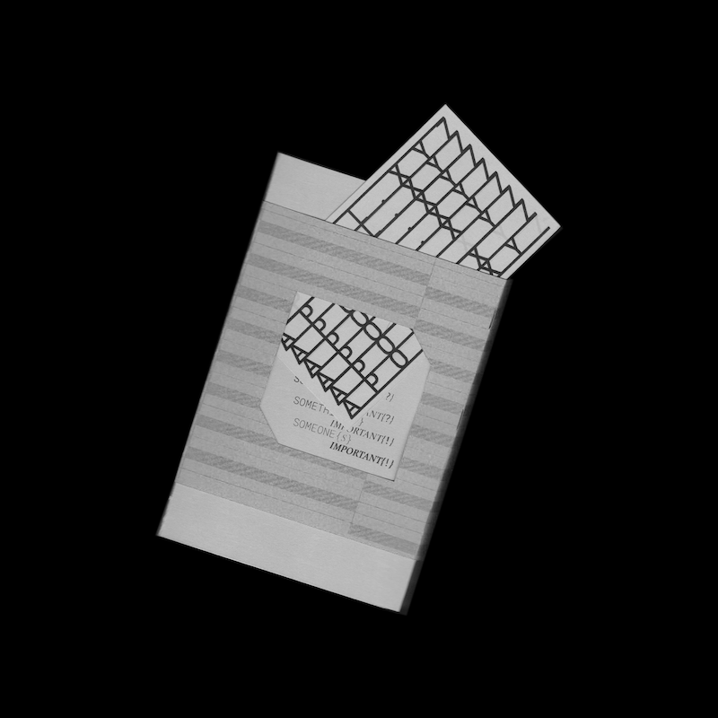
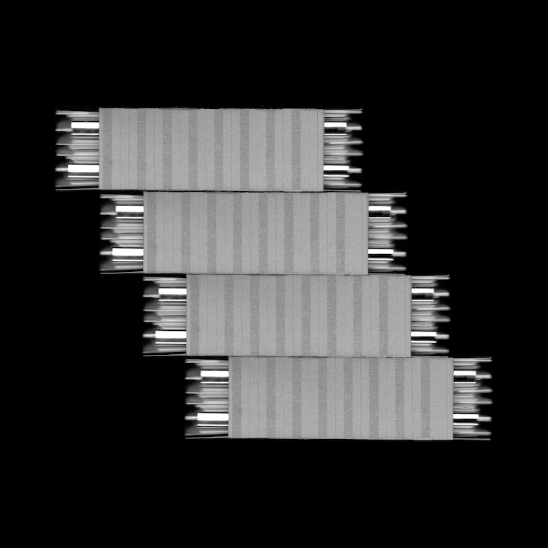
Each "calendar" contains 12 monthly pocket-size to-do list booklets. Each booklet employs a dynamic cascading grid with modular space for each day of each month. Booklets can be removed each month for daily use.
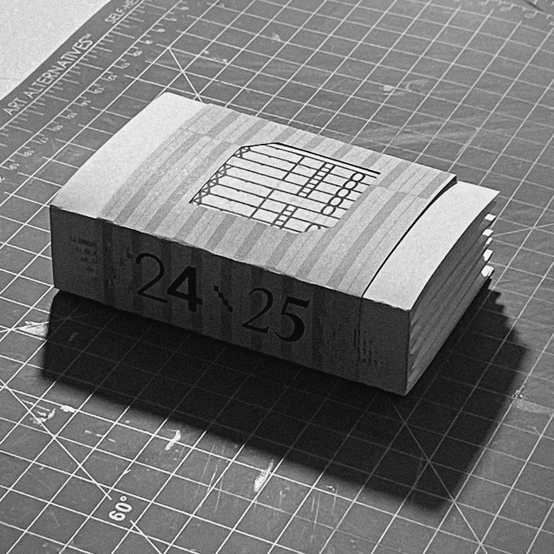
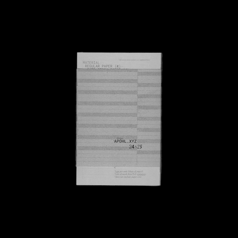
The container cover, built with a "Mississippi" binder, functions as storage for monthly booklets that are not currently in use, and incorporates a calendar of the 2024 year from beginning to end.
The cover design, which functions also as an invoice of cost and material, incorporates two open-source typefaces (Google Fonts).
To explore the modularity and graphic quality of the cascading grid, booklet cover designs are generated by creative programming via P5.js. Further documentation on the code and integration of tools in the project coming soon.
The calendars and booklets are printed in black and white, and color is introduced via material (paper).
COMPONENTS:
SLIP-COVER
CONTAINTER-COVER
MISSISSIPPI-BINDER (ACCORDION-BINDER)
MONTHLY-BOOKLETS
OPEN_SOURCE_HOW_TO_MANUAL
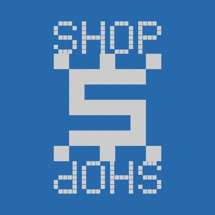
To order a calendar, please visit:
apohl.xyz/shop
Thanks to:
My dogs / My students / Ryan / Rachel / Taggert / Daniel / Hunter / Amber / Mary / Graham / My family / Birds / Music / Love / Grief / 2023 / Mississippi /
Many
_Many
__Many
___More
#opensource #bookbinding #mississippi #calendar #2024 #DIY #bookdesign #experiment #alternativedesign #somethingimportant #someoneimportant


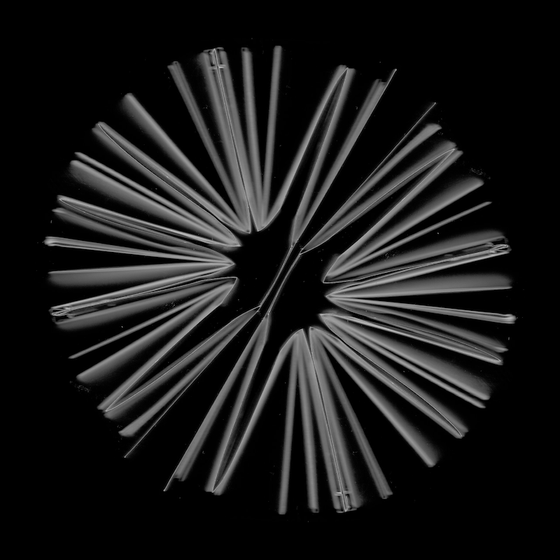

BOOK_BIND
The Mississippi Bind, or Mississippi River Bind, is an accordion style binding system that incorporates a series of cuts, scores, and folds to create a modular booklet inserts as an alternative to more traditional methods of book binding.
The Mississippi Bind is an ongoing research project into methods of open source, accessible, and alternative book binding, focusing on use of minimal or limited material and tool availability.
The graphic structure of the Mississippi Bind, with its meandering zigs and zags, is reminiscent of the twists and turns of the Mississippi River. Along with its conception in the state of Mississippi itself, this is where the system finds its name.
This project is ongoing.
#m!ss!ss!pp!

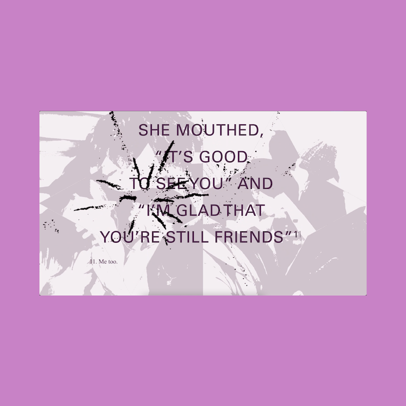
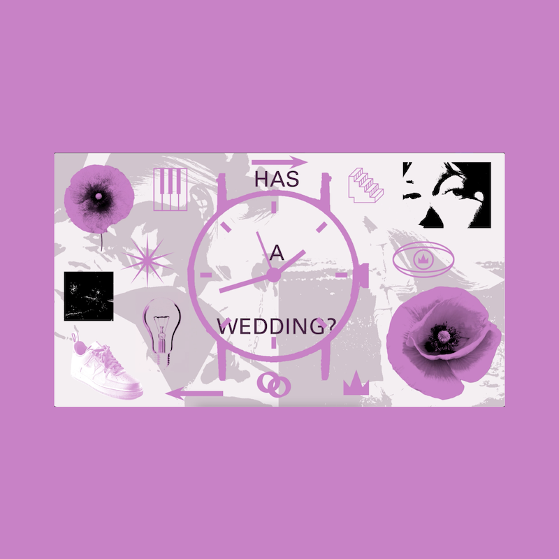
LOVE!
Interactive wedding invitation(s) designed for love and dear friends.
The "flowers" are built from a grid a two tessellating shapes, each functioning as positive and negative space for the other. Laser cuts are incorporated to produce a threshold among the flowers, and a frame for typography.
#love


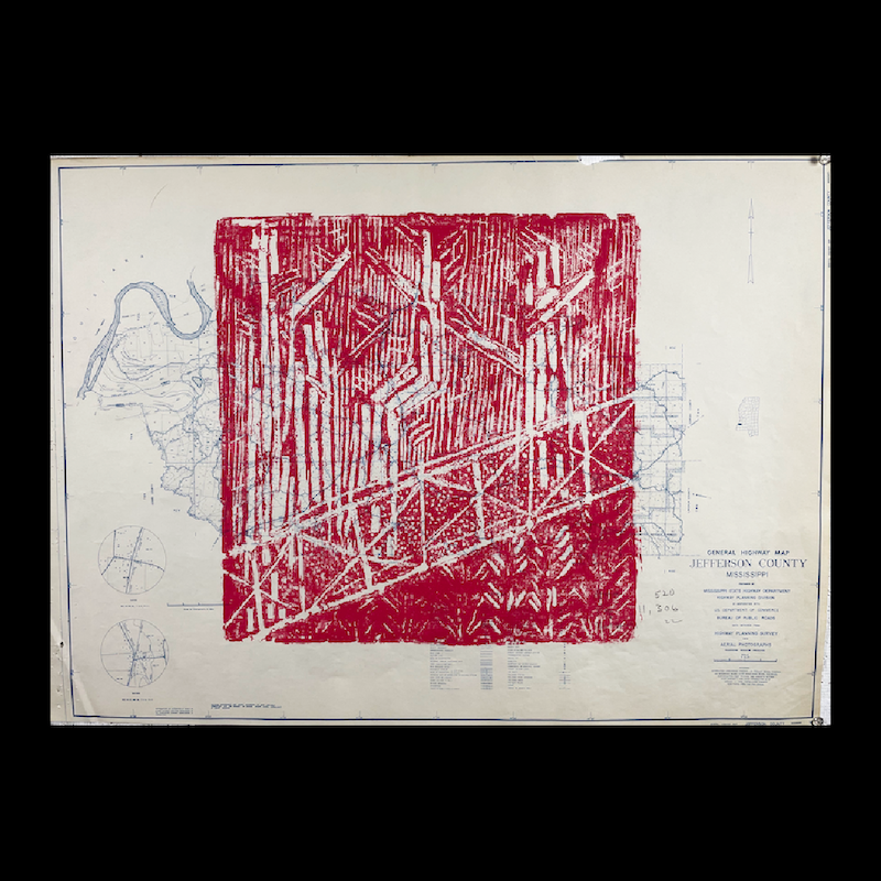
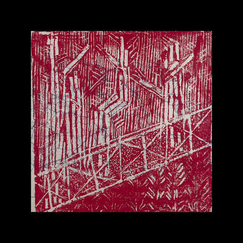
PRINT_SERIES
This projects functions both as an experimentation of alternative methods for image and printmaking, as well as a reflection on the Mississippi (M!SS!SS!PP!) identiy.
The prints are made on sixty-three 1950s Mississippi highway and county maps, donated to the Mississippi State University (MSU) Art Department on behalf of the MSU Department of Geosciences. The print itself, an image of my own backyard, is carved into a foam insulation tile and printed onto each map directly.
#alternativemethods #imagemaking #printmaking #m!ss!ss!pp!


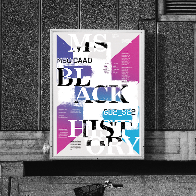
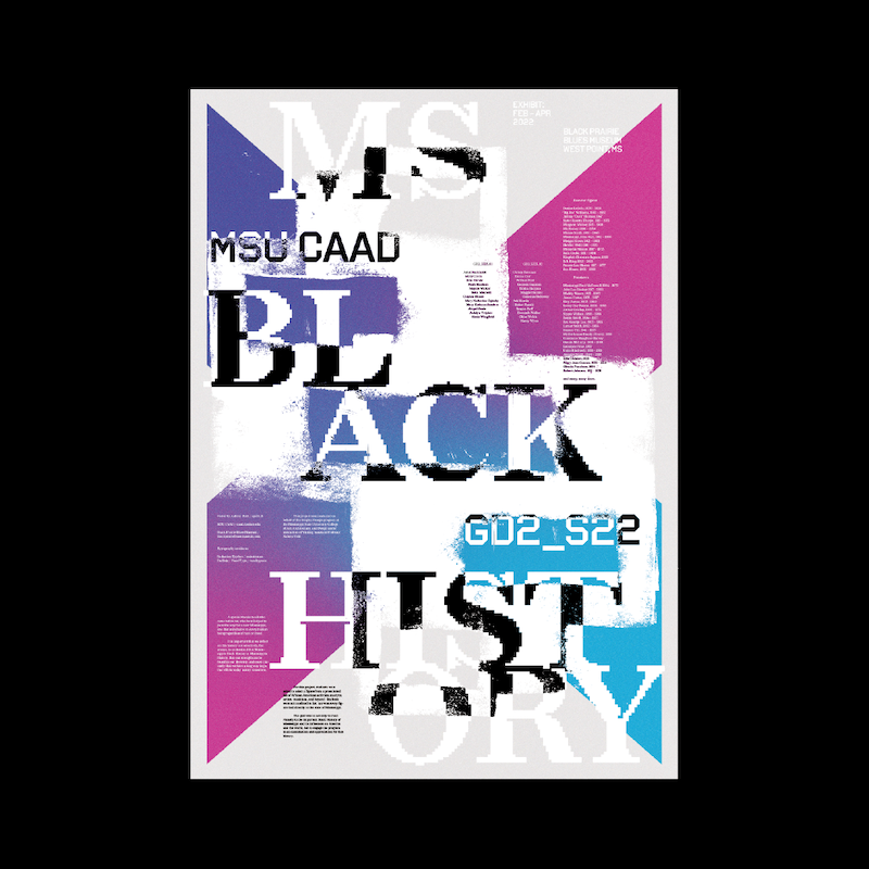
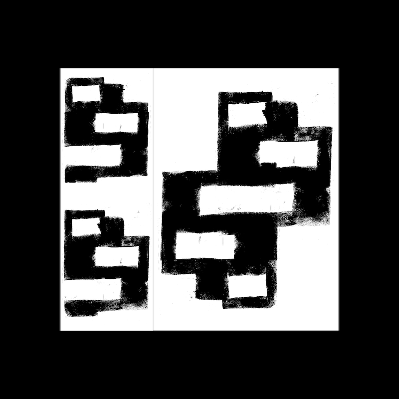
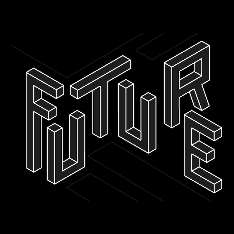
KEY_VISUAL
Key Visual for a previous exhibit at the Black Prairie Blues Museum in honor of Mississippi's Black History. The exhibit featured a series of commemorative posters designed by students of my Graphic Design 2 course to represent figures of Mississippi Black History.
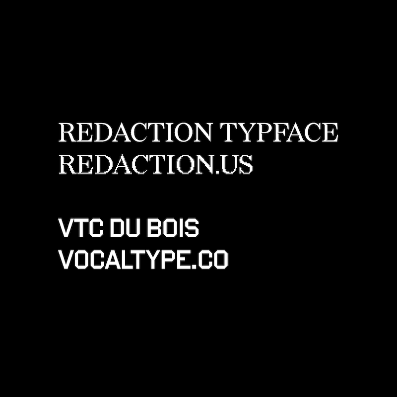
This poster features compelling and narrative driven typefaces including VTC Du Bois by Vocal Type, and Redaction Typeface by Forest Young and MCKL Type as an extension to the Redaction Project by Titus Kaphar and Reginald Betts.
#mississippi #blackhistory #blues #blackhistorymonth #blm #blacklivesmatter #design #msucaad #posterdesign

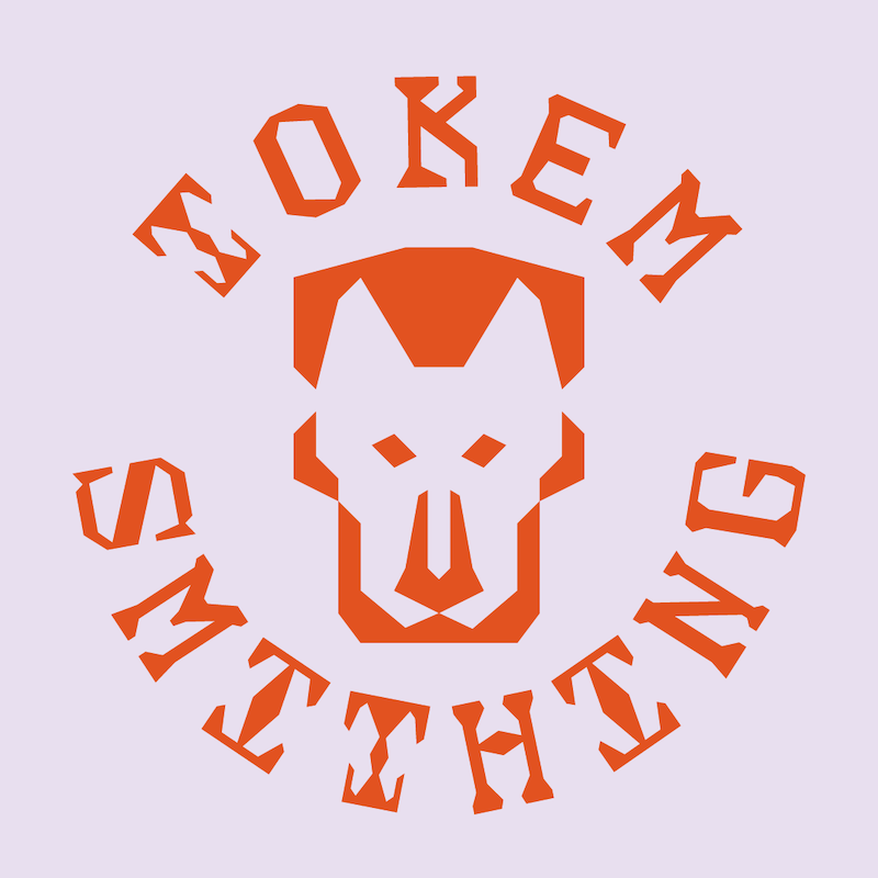
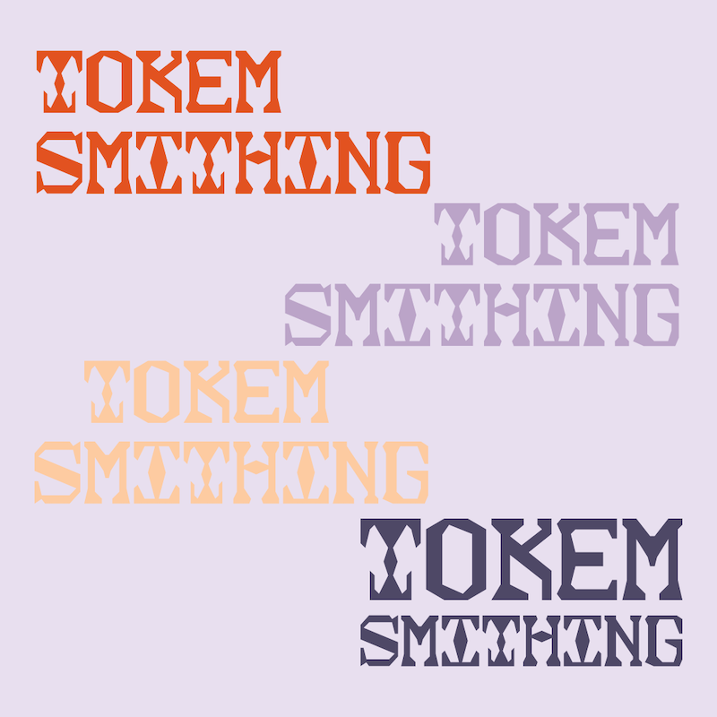
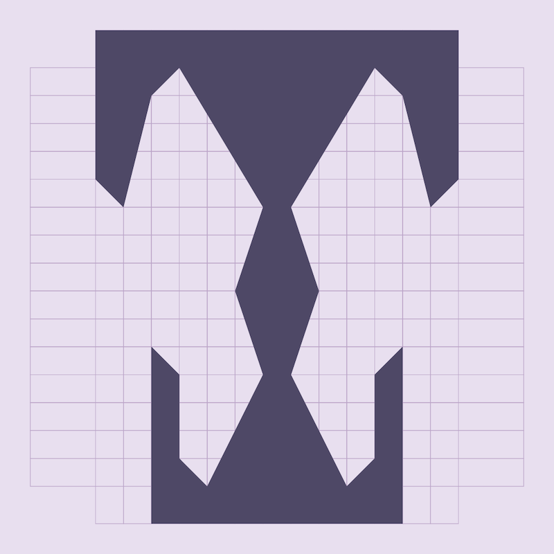
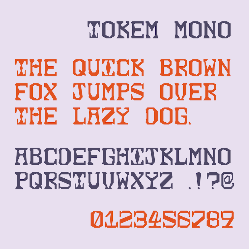
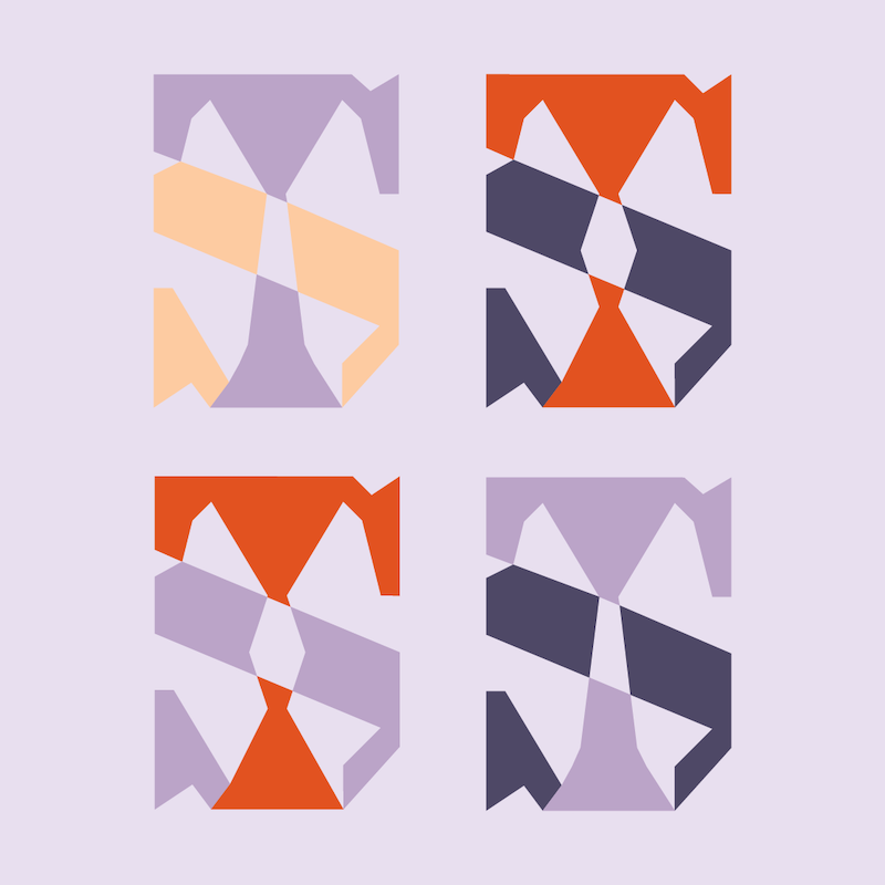
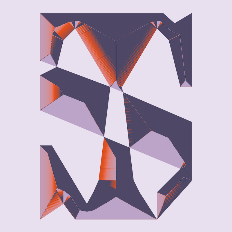
IDENTITY
Tokem Smithing is an independent silver and jewelry smithing business based in Colorado. Each piece is hand made, molded, and cared for.
The objective is not only to develop a logo system and logo display face, but to create a fully immersive design system that shares form, grid, and style from one mark to the next.
#logo #logodesign #typefacedesign #systematic_design #identity #branding


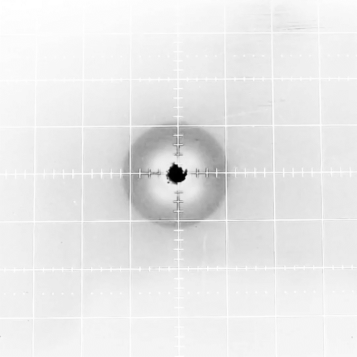
CREATIVE_CODE
These experiments explore the intersection of two eras of technology; creative programming via Processing, and an XY Oscilloscope.
Utilizing simple math and as minimal code as possible, XY Poems creates short form coded visual poetry that utilizes basic forms. The "poems" are displayed and run through the analog method of an Oscilloscope. Textue and motion are observed and documented. The outputs seen here are recordings of the Oscilloscope display.
#creativecoding #analog #poetry #oscilloscope #processing


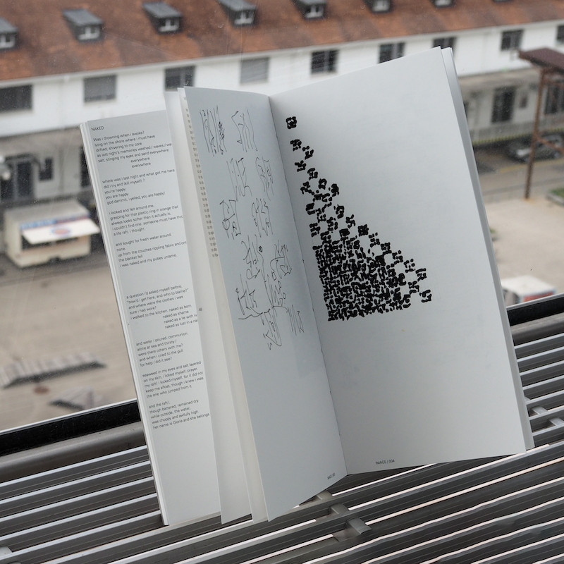
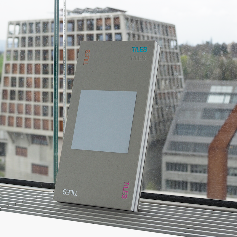
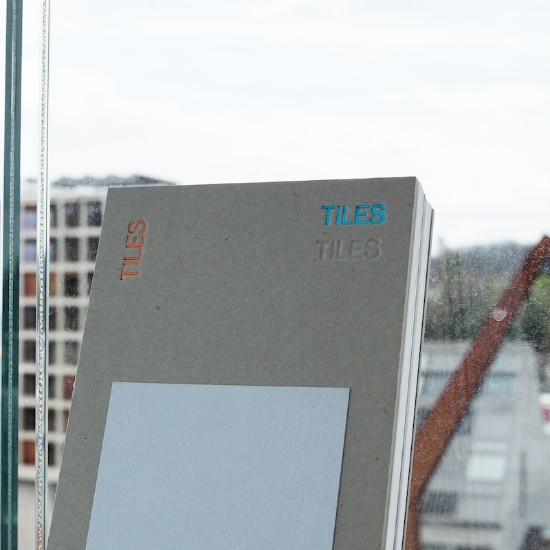
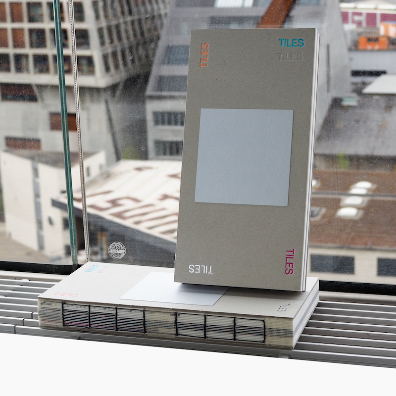
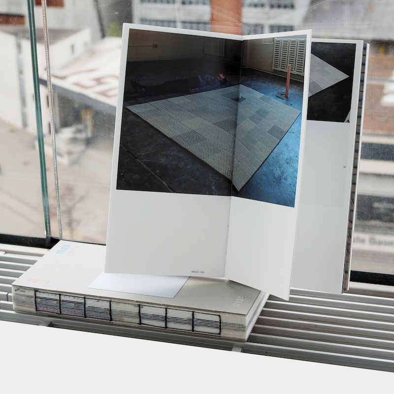
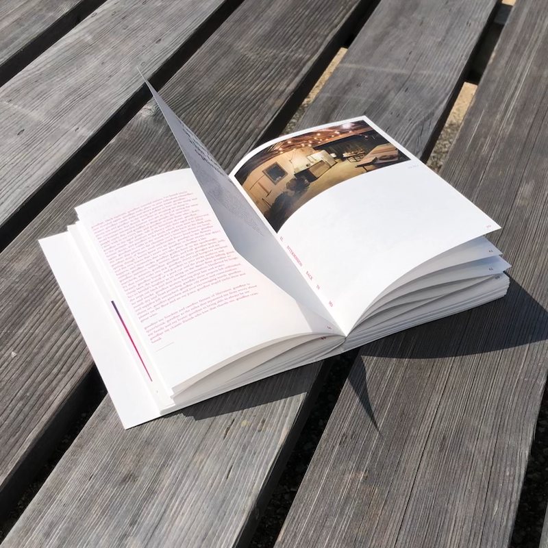
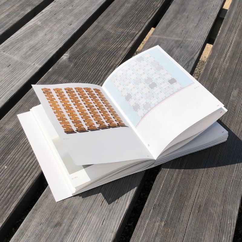
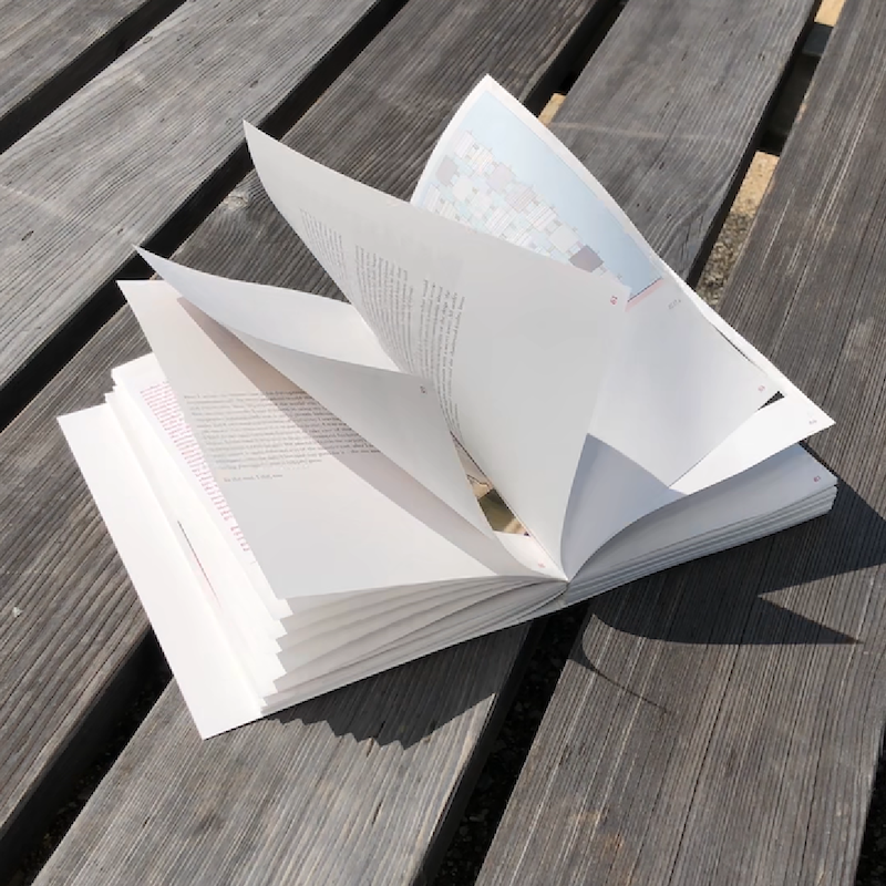
BOOK_DESIGN
TILES is a collaborative project between myself and potter, poet, architect, artist, and close friend Daniel Smith.
The book reflects one of his conceptual architectural processes of tile making into the production of a book that outlines both our relationship as friends and peers, but also as creatives.
#book_design #architecture #editorial #ceramics #layout


KEY_VISUAL
Key Visual for a previous exhibit at the Black Prairie Blues Museum in honor of Mississippi's Black History. The exhibit featured a series of commemorative posters designed by students of my Graphic Design 2 course to represent figures of Mississippi Black History.
This poster features compelling and narrative driven typefaces including VTC Du Bois by Vocal Type, and Redaction Typeface by Forest Young and MCKL Type as an extension to the Redaction Project by Titus Kaphar and Reginald Betts.
The abstract graphic form interacting with the typography stands to represent the windows through which we revisit and recall these histories.
The "X" form found in the background refers to similar forms that can be found historically in flags that symbolize neo-confederate, anti-black, extremist right, and racists ideologies. It is featured here as a reminder of what has taken far too long to overcome, and in some cases persist, as well as to reclaim the graphic form of the "X" into new symbolism.
#mississippi #blackhistory #blues #blackhistorymonth #blm #blacklivesmatter #design #msucaad #posterdesign

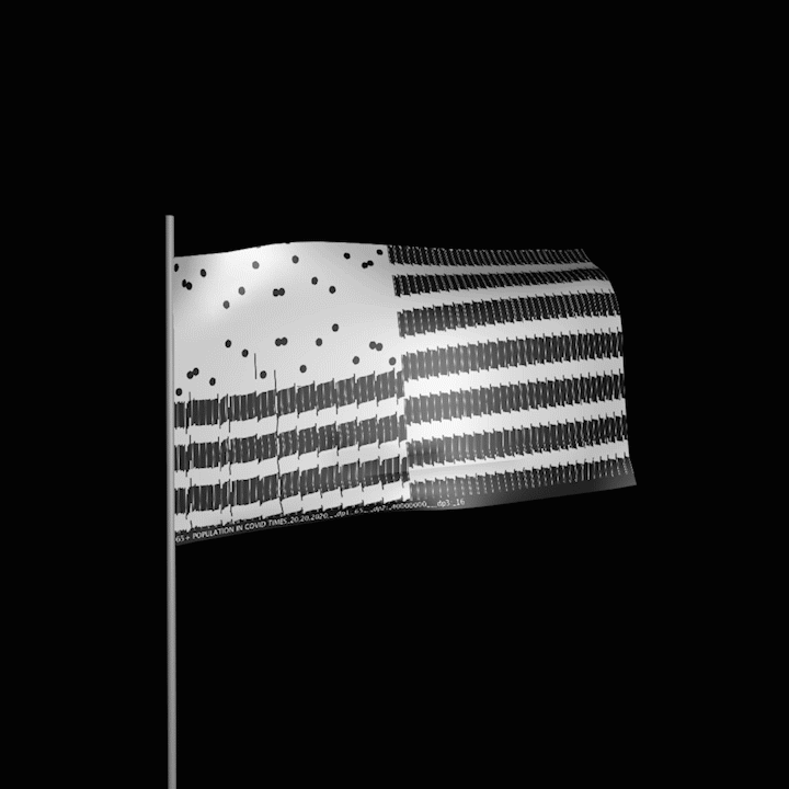
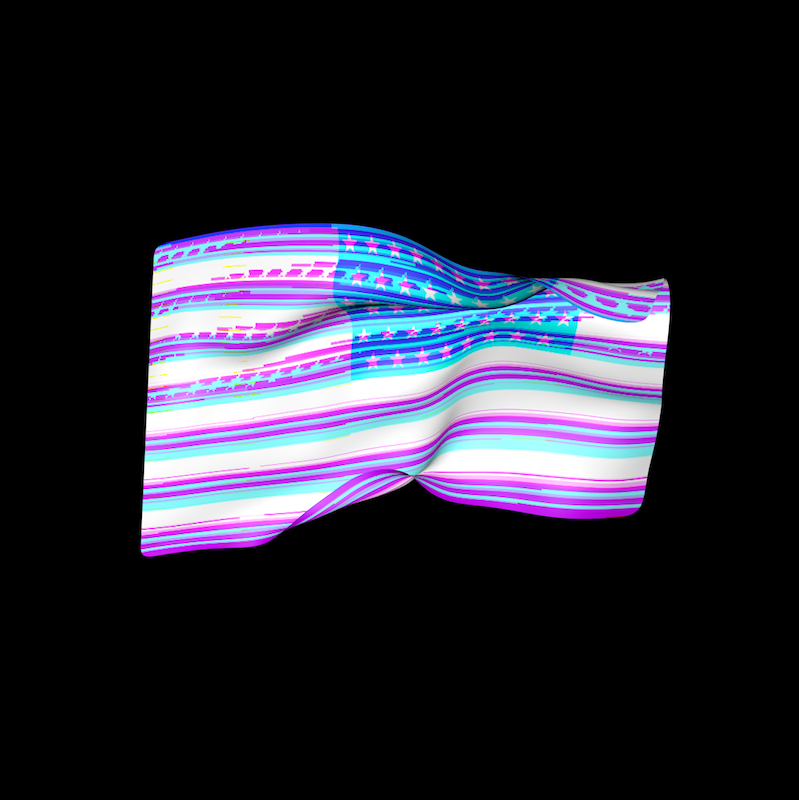
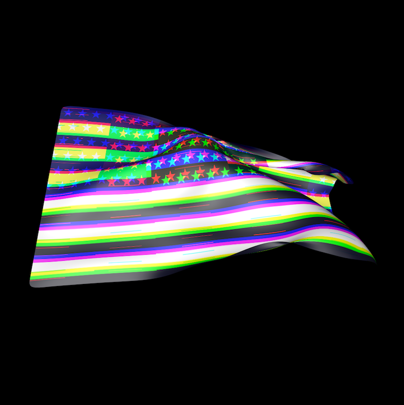
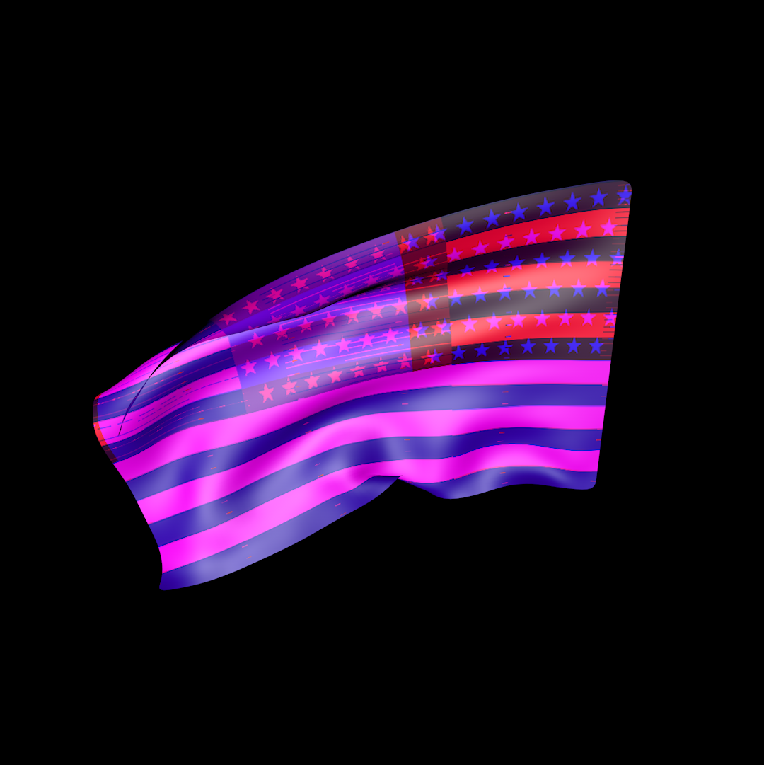
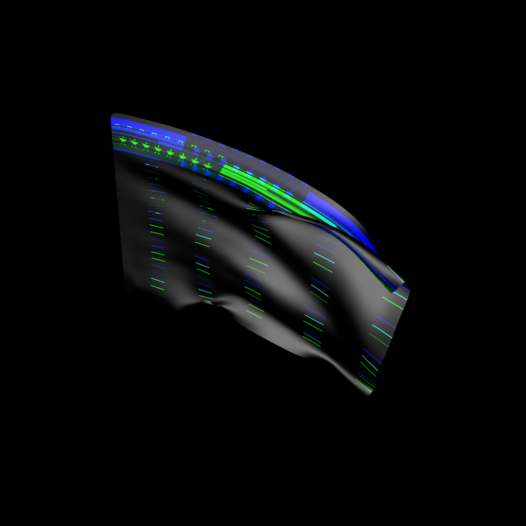
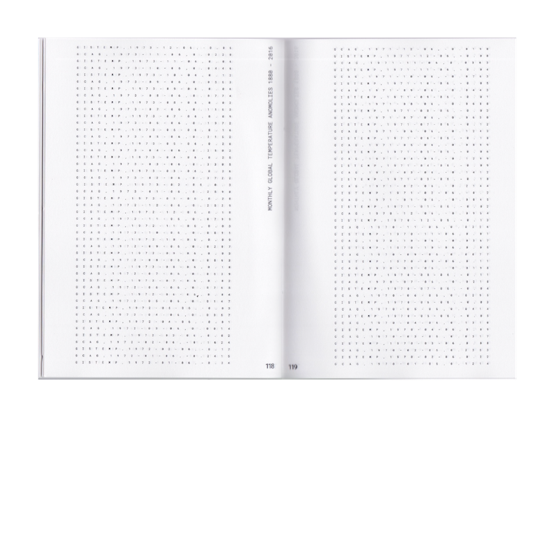
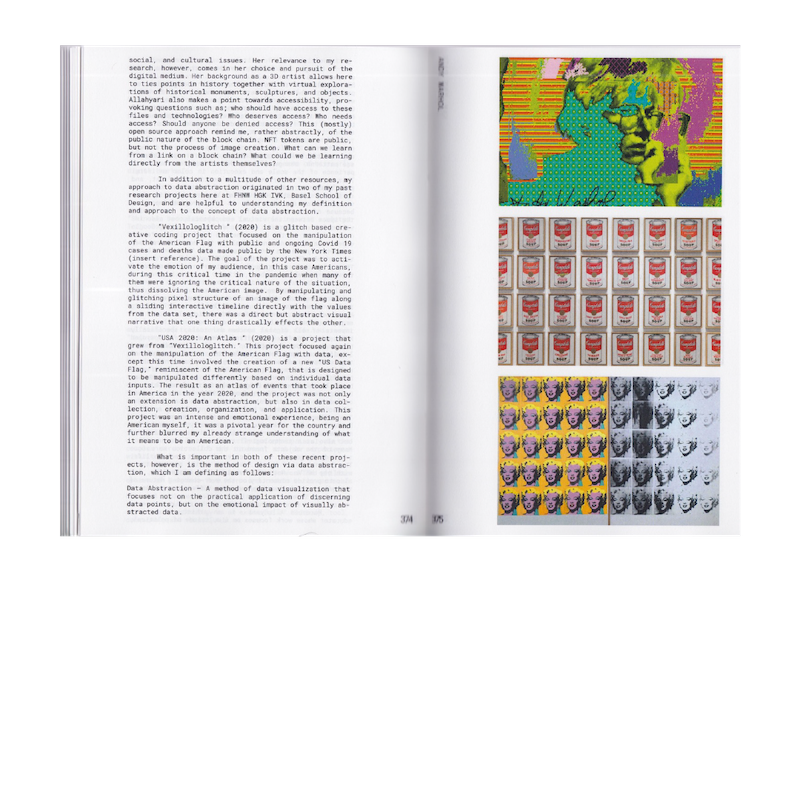
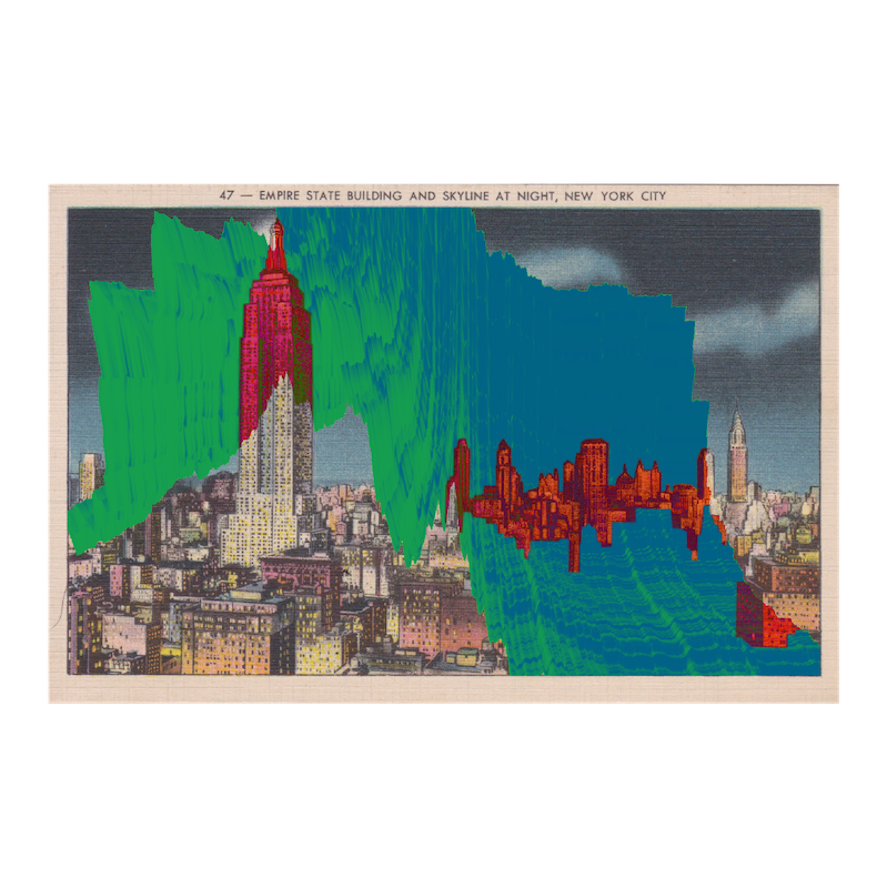
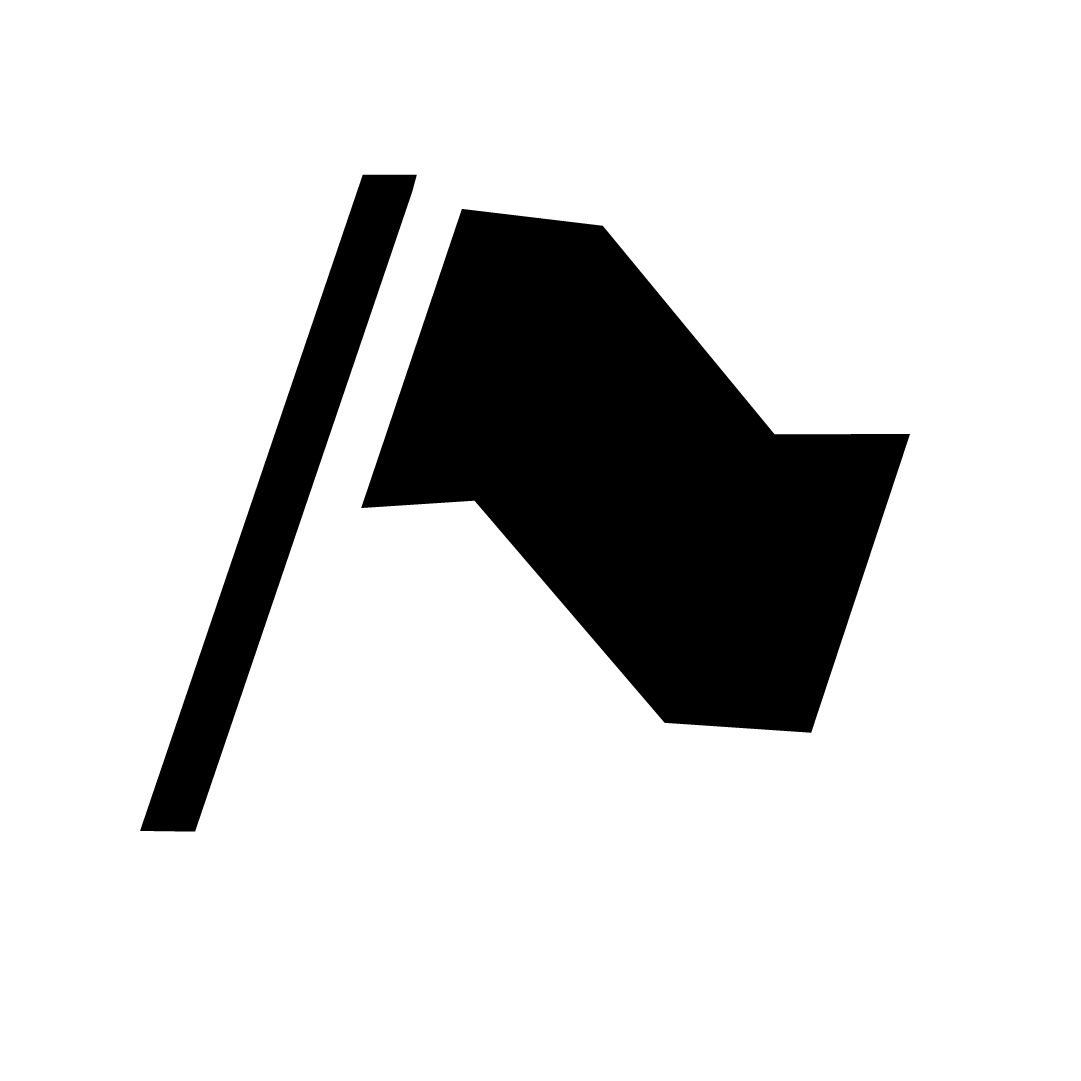
RESEARCH
This project observes the fragility of the american identity in the year 2020, as well as my own perceptions of my identity as an american (from Mississippi), via experiments with flag manipulation and creation, and data abstraction.
This project crosses the threshold of many disciplines, as the design practice often does, including but not limited to: anthropology, vexillology, journalism, and statistics.
Data is both collected and generated.
I choose to use the term data abstraction as opposed to data visualization, as I do not hope for these experiments to stand as practical applications for understanding data, but rather a method for utilizing data as a tool for visual narratives.
DESIGN QUESTION(S):
1. In what ways can the manipulation and creation of flags be used to express current and ongoing narratives by way of data abstraction?
2. What are the inherent rules of flag design, and how are these narratives contained, received and sustained in the flag as a medium over time?
#creativecoding #research #vexillology #flag #usa #2020 #data_visualization


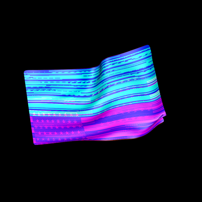
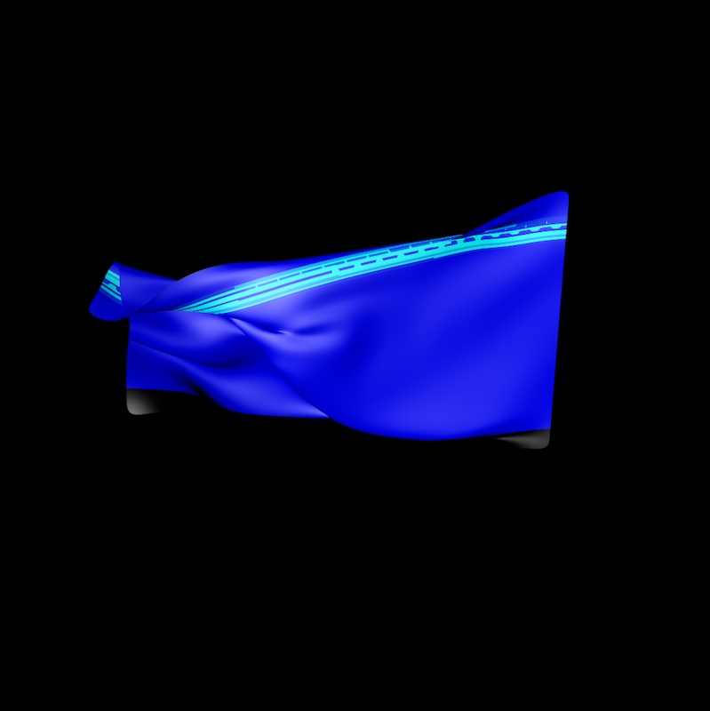
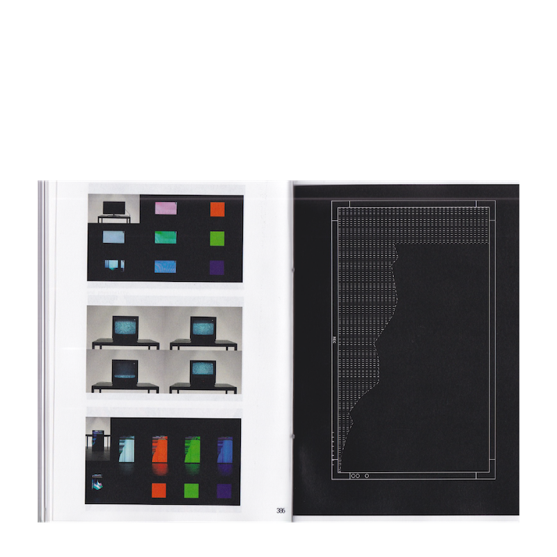
RESEARCH
Vexillologlitch aims to visualize the effect of the COVID-19 pandemic on the cultural image United States in real time. The tool functions as a timeline, using New York Times data to manipulate the image of an american flag on a structural level.
This project is under construction.
#creativecoding #research #vexillology #flag #usa #data_visualization


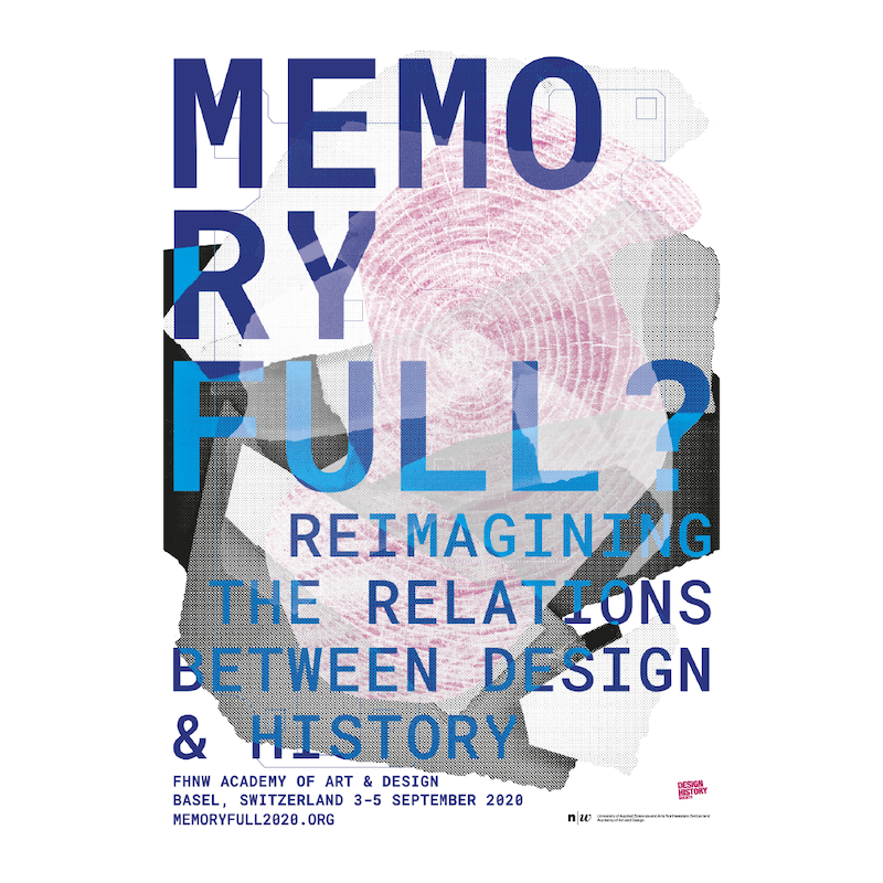
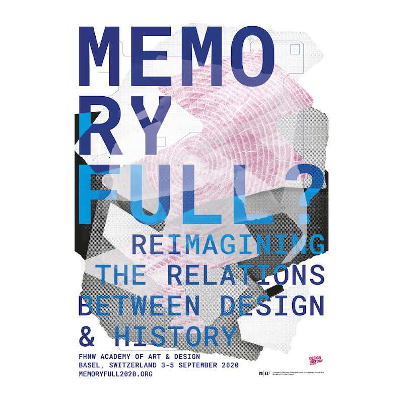
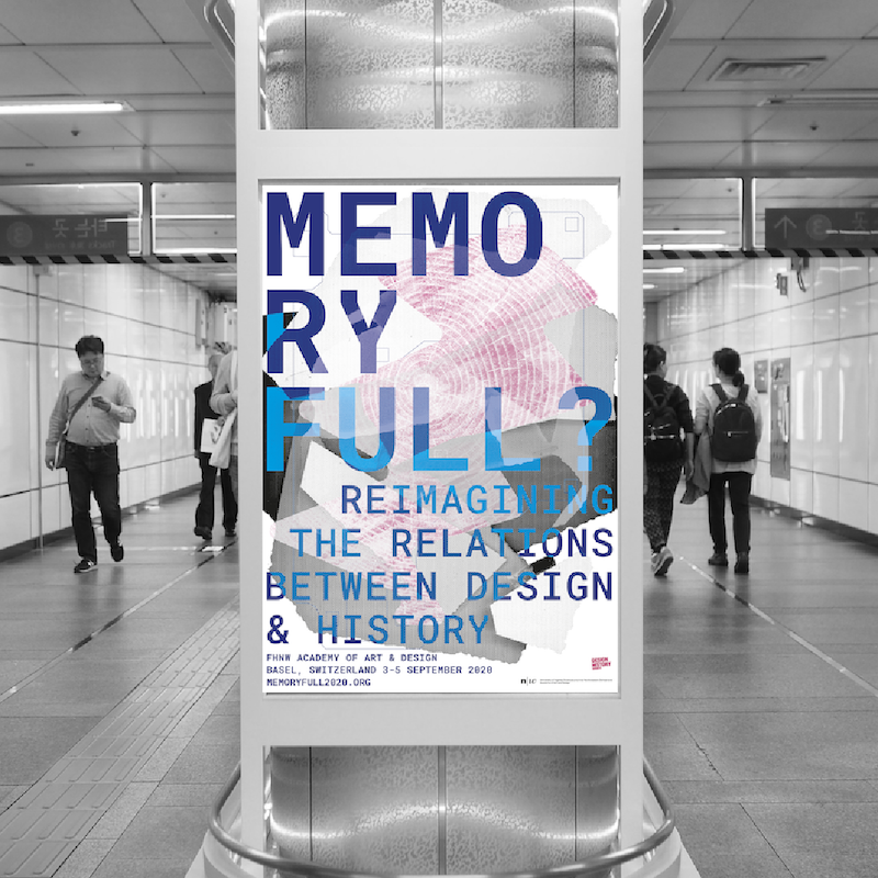
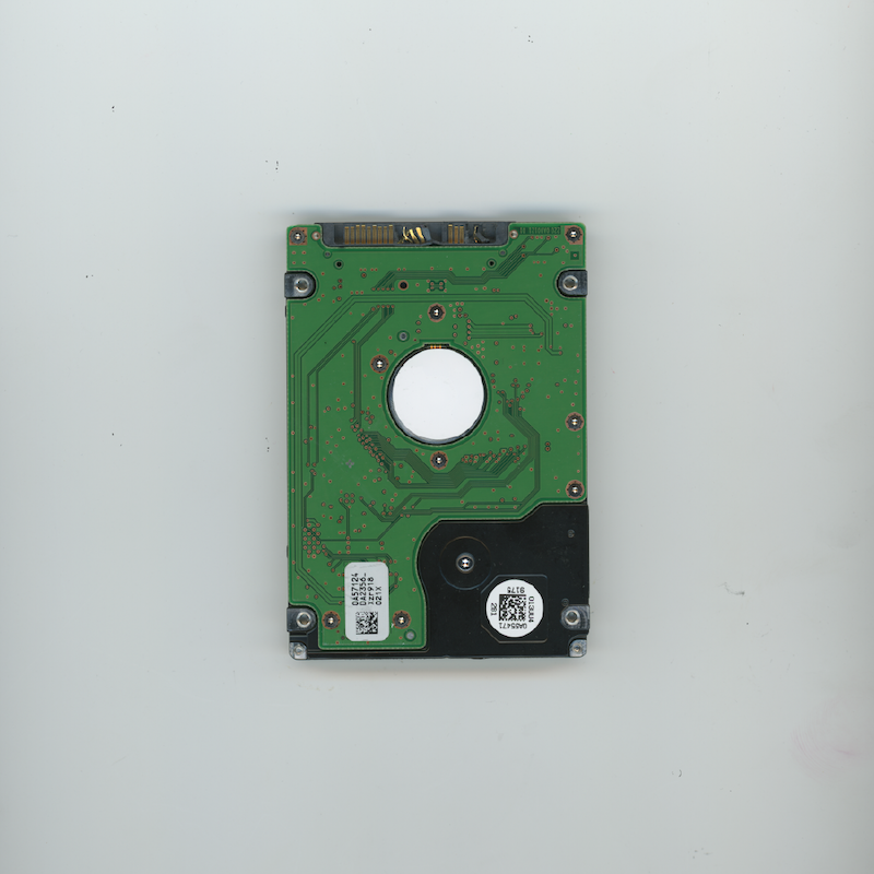
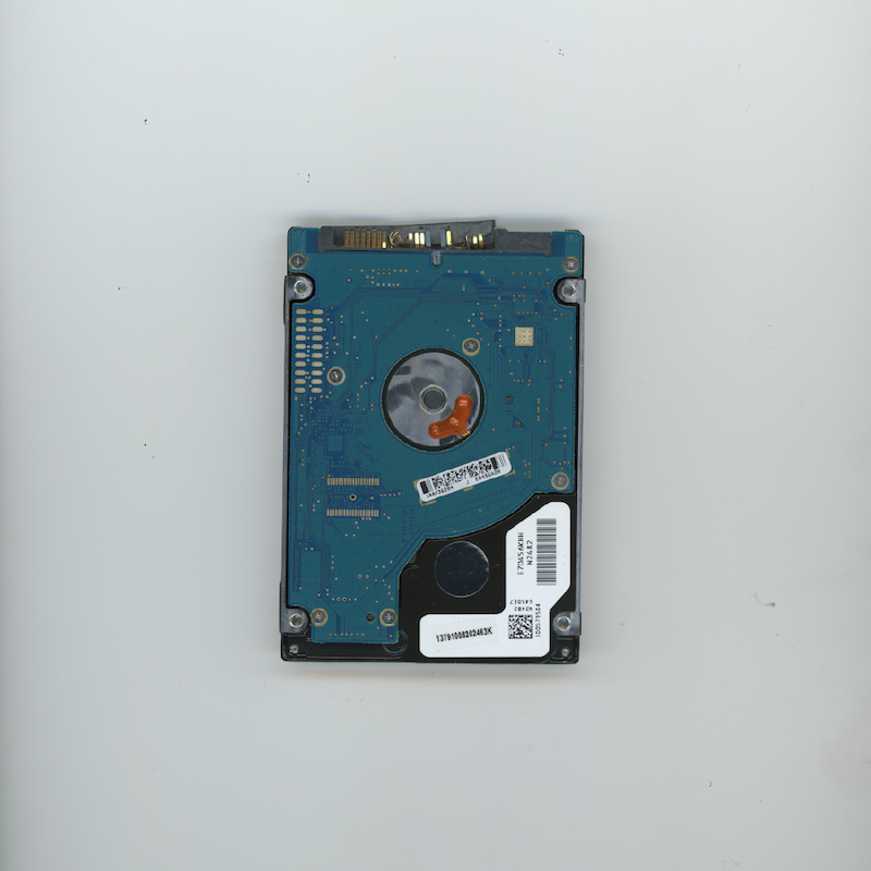
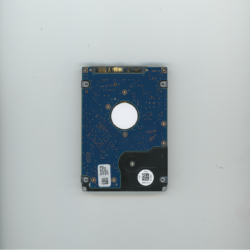
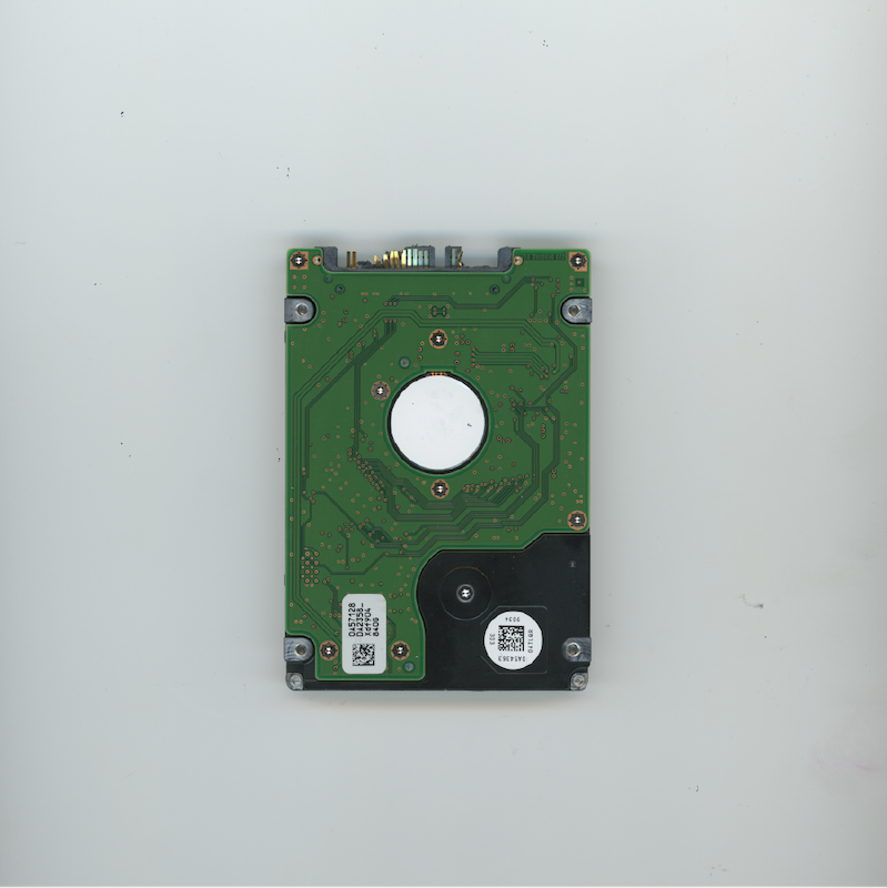
KEY_VISUAL
Key visual, identity, social media, and website design for the Design History Society annual conference, Memory Full?, held virtually from Basel, Switzerland.
This project focused on abstracting objects and motifs of memory through a pseudo-surrealistic approach that began with the abstraction and translation of computer hard drives as an object of memory itself.
MEMORYFULL2021.ORG
#keyvisual #poster #identity #designhistory #swissdesign

CODING
My portolio site is not only a space to archive and document work, but also to continue my experimentation and exploration with code as medium.
These sketches exhibit different P5.JS interfaces that have been used as landing pages or interactions among my site(s). Above all, they are for exploring, playing, and experimenting.
#creativecoding
BOOK_DESIGN
This book is designed to contain my final Thesis research at the FHNW Basel School of Design, Visual Communication Institute.
The book is hand printed, Swiss bound, and completed in beautiful, downtown, Basel, Switzerland.
#book_design #research #creativecoding #design_research


BOOK_DESIGN
Daniel Smith is a potter, poet, architect, artist, and close friend. This book is number two in a series of collaborations, and outlines Daniel's projects, research, experiences, and friendships that were made during his time in the Master of Architecture program at Cranbrook Academy of Art.
The book is hand printed, Swiss bound, and produced in beautiful, downtown, Basel, Switzerland.
#book_design #architecture #editorial #ceramics #layout


IDENTITY
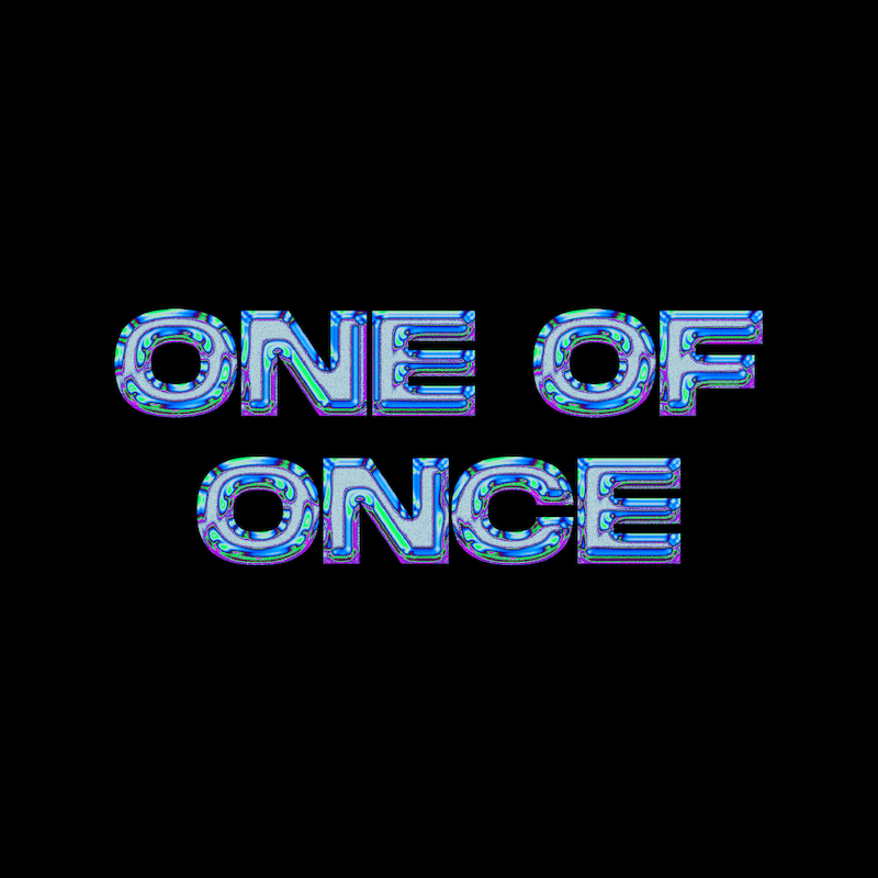
This is a logo(?)
ONE OF ONCE
is a one-of-a-kind entertainment and event booking experience.
This logo system hopes to push the boundaries of functional logo design as a reflection of its message.
#logo #logodesign #systematic_design #identity #branding


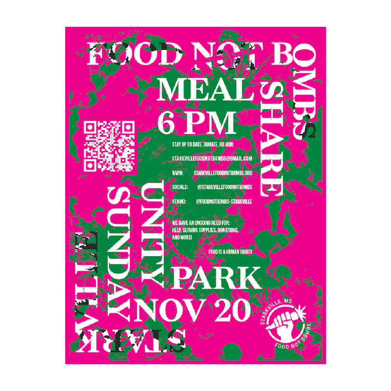
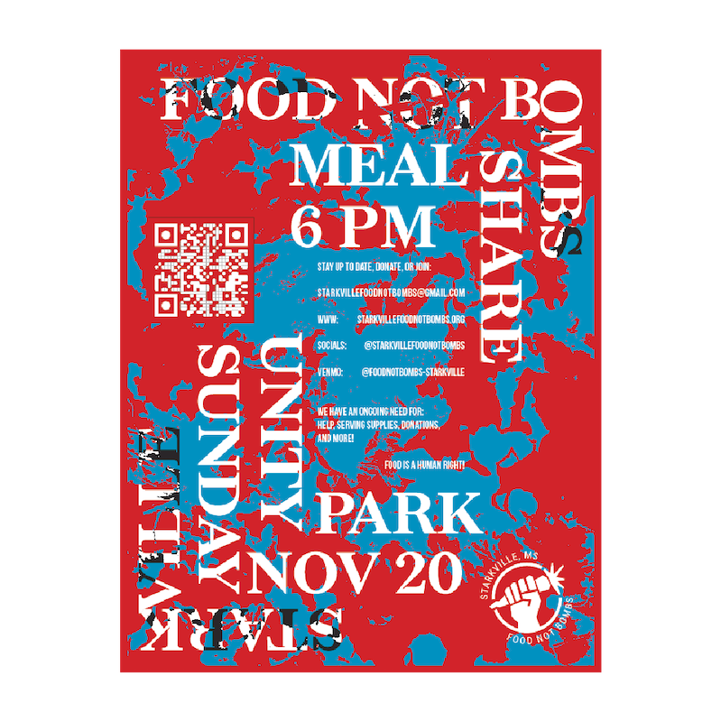
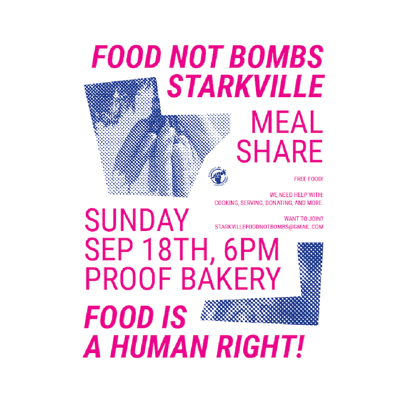
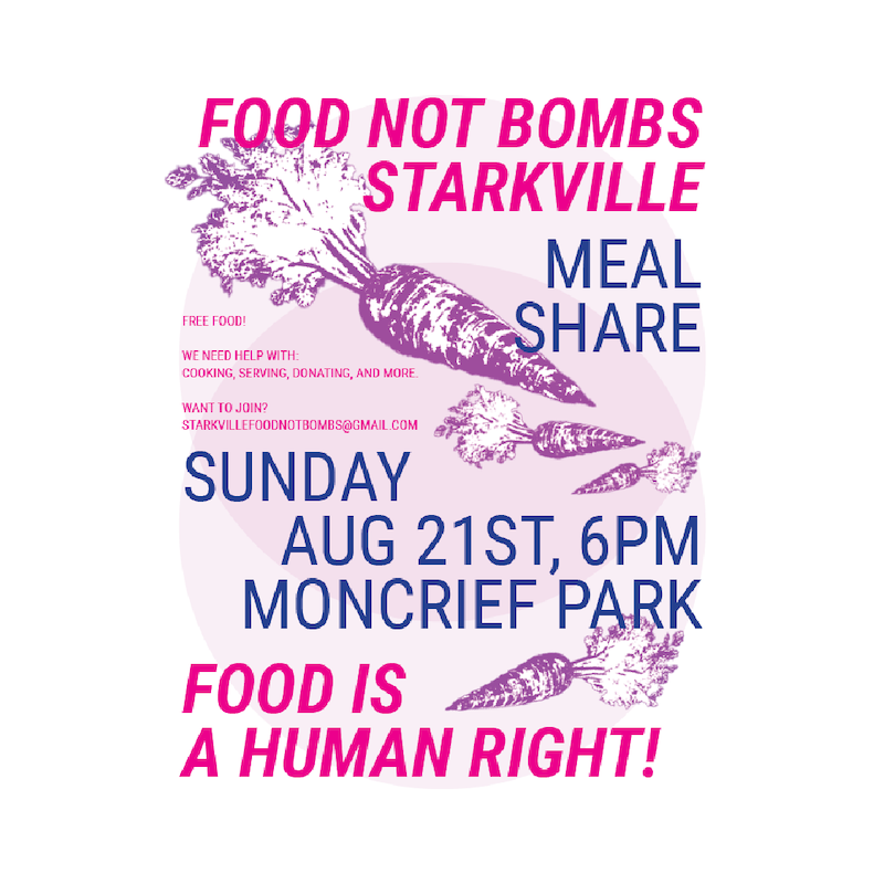
POSTER_DESIGN
Flyer and website design for the Starkville, MS Food Not Bombs chapter.
Here you see an ongoing archive of the posters for each month's meal share. Solidarity over charity!
STARKVILLEFOODNOTBOMBS.ORG
#flyer #posterdesign #foodnotbombs #solidarity


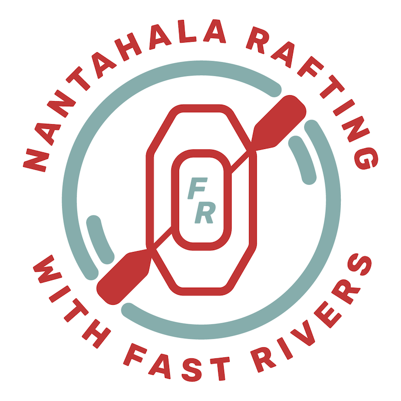
IDENTITY
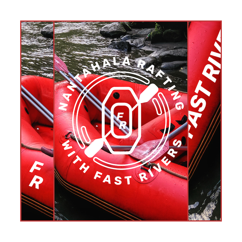
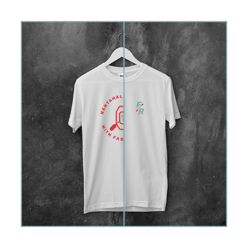
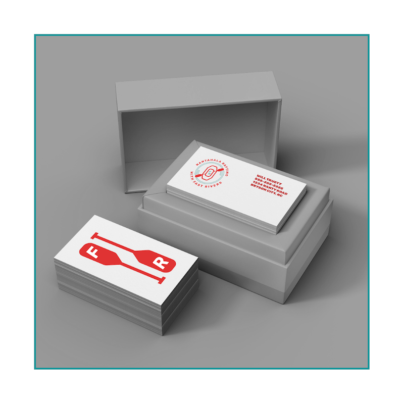
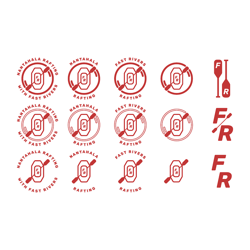
Nantahala Rafting with Fast Rivers is a premiere stop for white water rafting in western North Carolina.
The logo is designed to be modern and rustic, exciting but welcoming, and to stand out among its peers in the Nantahala gorge.
#logo #logodesign #systematic_design #identity #branding

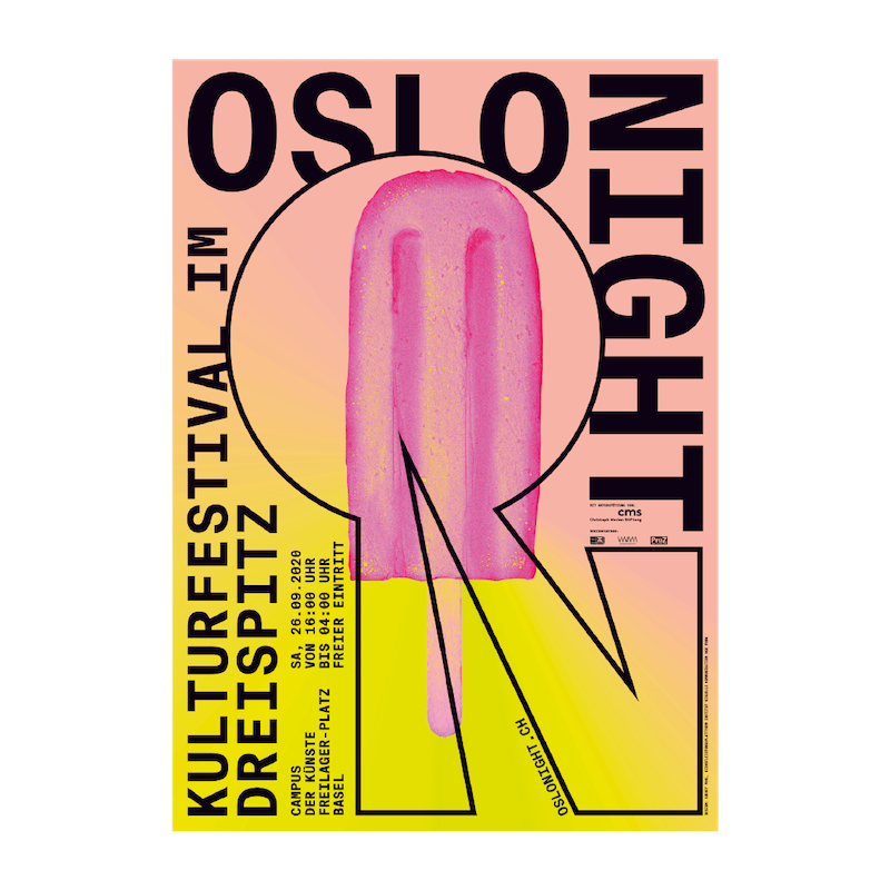
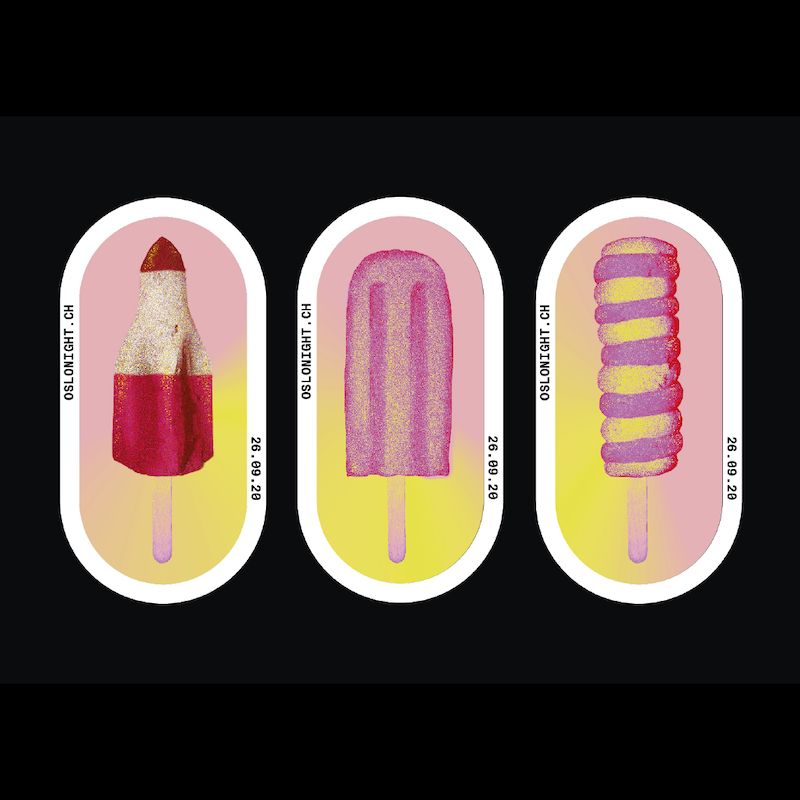
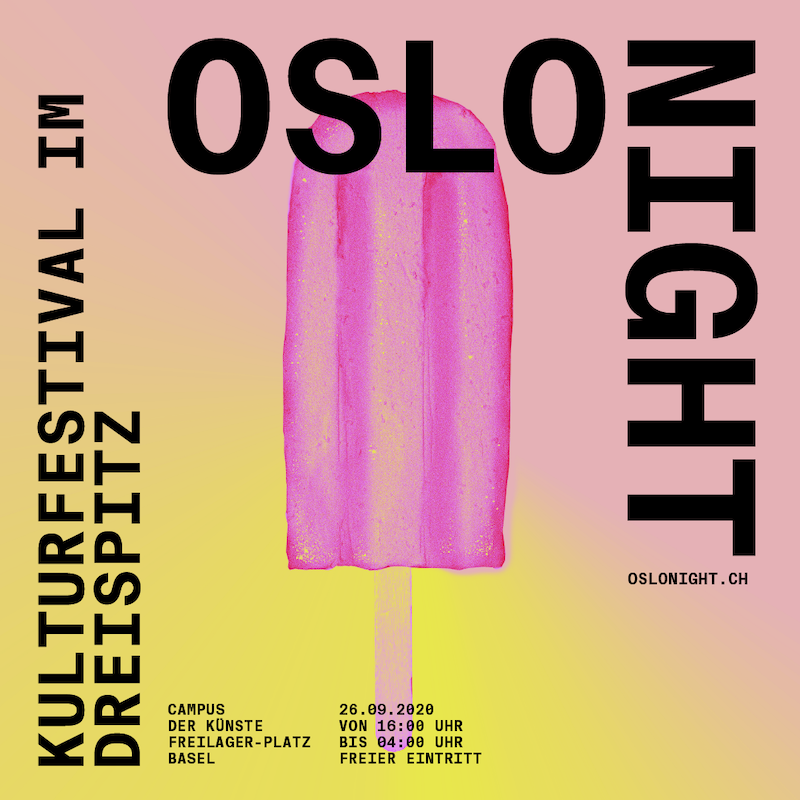
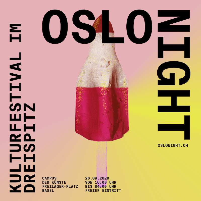
KEY_VISUAL
OSLO NIGHT is an annual culture and arts festival held at the Dreispitz area in Basel, Switzerland that takes place from sun-up to sun-down. The festival highlights a mix of mediums, institutions, ideas, and exchanges.
This key visual and its elements are designed in collaboration with and under art direction of ANDICO LAB.
#keyvisual #poster #identity #designhistory #swissdesign

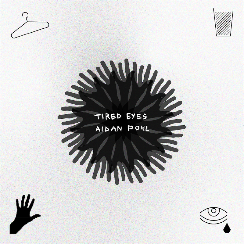
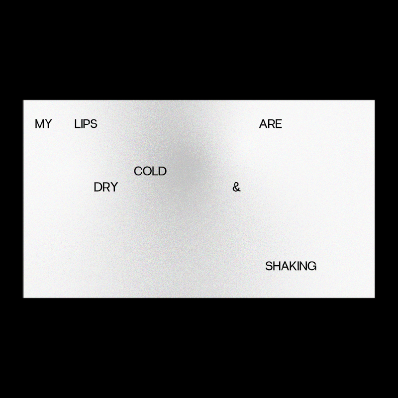
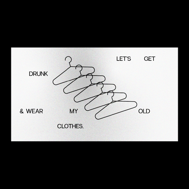
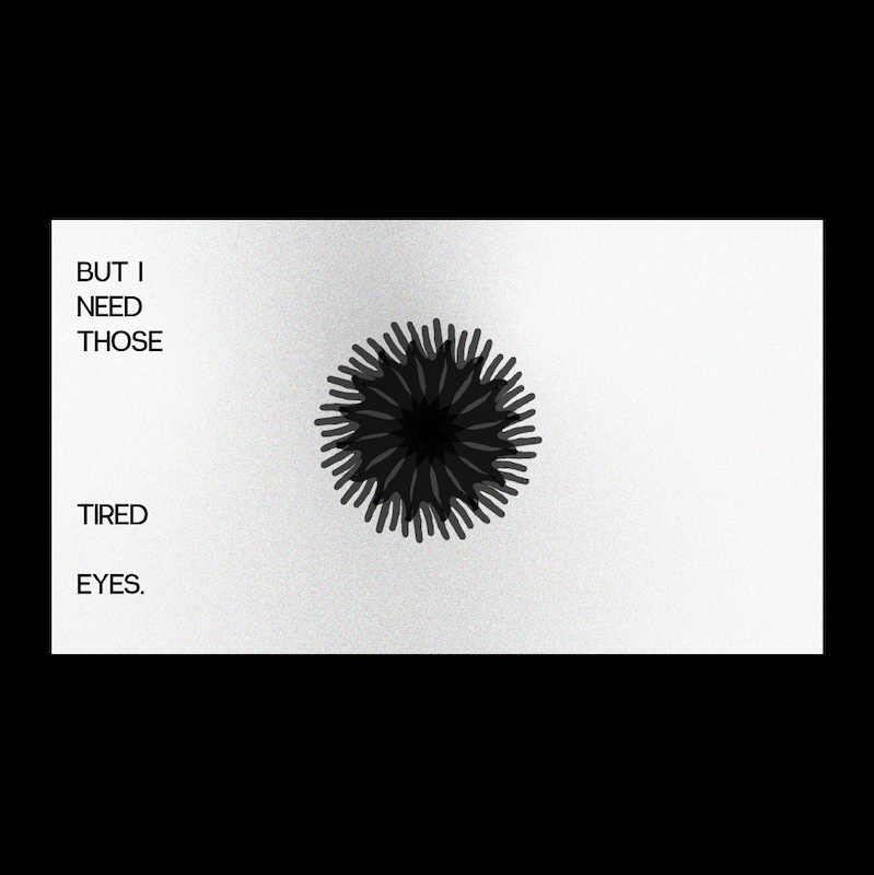
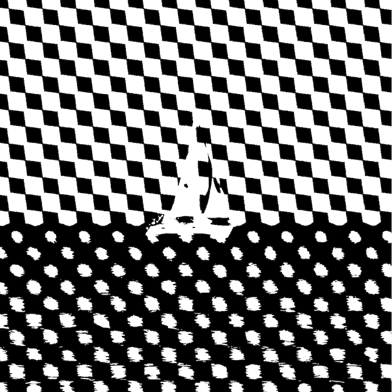
MUSIC_VIDEO
Lyric video for "Tired Eyes" by Aidan Pohl
#lyricvideo #musicvideo #music #musicdesign


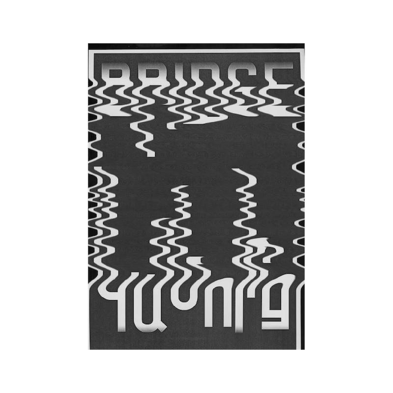
IDENTITY
Logo typography and marks designed in 2019 for my brother, Aidan Pohl. Aidan is a storyteller, songwriter, and musician from Mississippi currenlty based in Los Angeles, California. His music is emotional, captivating, and tells stories with a harmony between personal, and universal narratives.
Today, you can find Aidan telling stories in a new form at Pohl Racing on Youtube.
#logo #logodesign #systematic_design #identity #branding

KEY_VISUAL
Designed with Lusine Saghatelyan, this poster explores the bridge that is formed when two cultures come together. In this case, Switzerland and Armenia.
#keyvisual #poster #exchange #language #collaborative

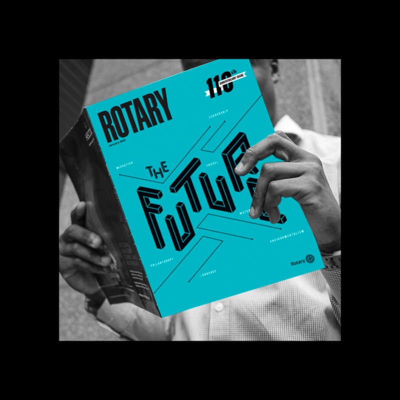
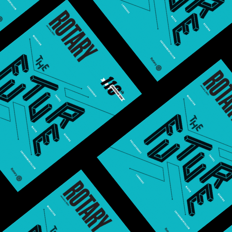
KEY_VISUAL
Cover design for the 110th Rotary Magazine.
#keyvisual #poster #rotary #magazine #coverdesign

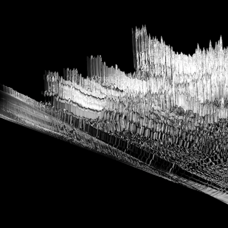
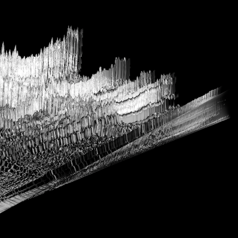
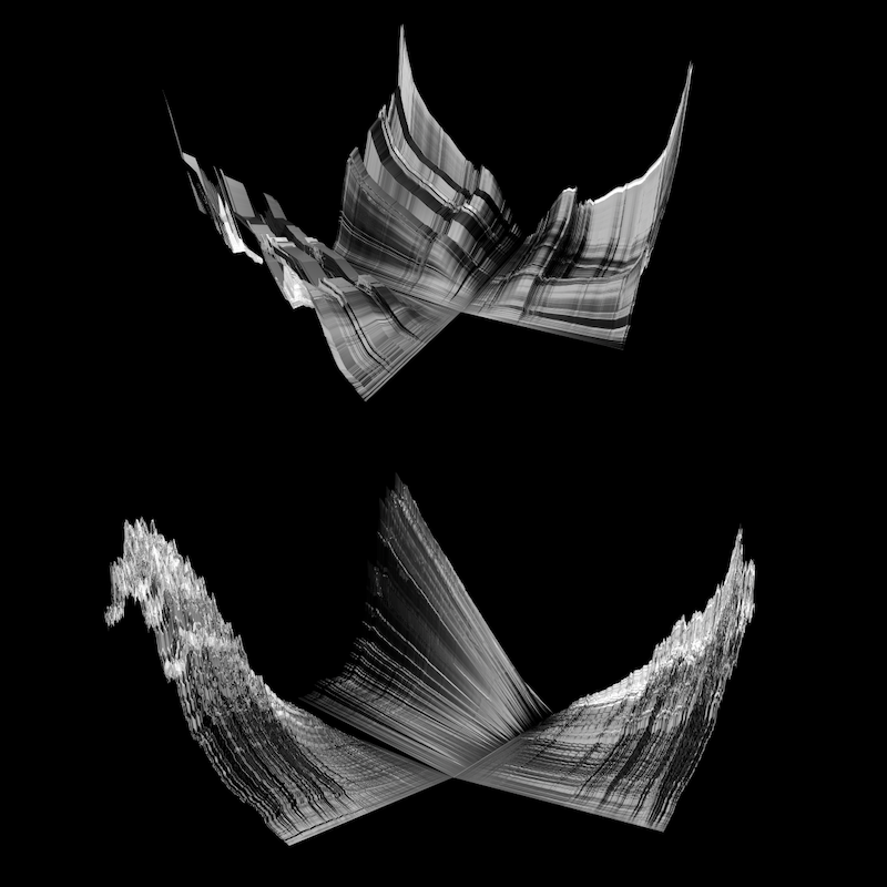
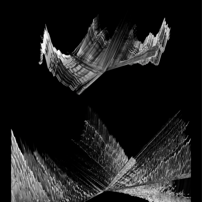
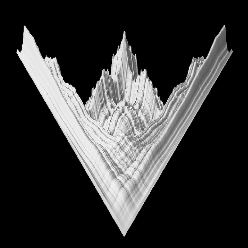
RESEARCH
NF-TVS is a design research project completed for the International Master of Design Thesis at FHNW HGK Basel and UIC Chicago. All experimentation and research was conducted in Basel, Switzerland.
The aim of this project is to take a critical and experimental approach to the topic of NFT art spaces and marketplaces: To question the tangibility, value, and effects (consequences) of these spaces, which otherwise remain unseen, out of view, and unfelt.
This project is an experimentation in information design and data visualization. More specifically, I am working in the realm of data abstraction, which by my definiton fuctions as an intersection between emotional and practical data visualization design.
NF-TV.ORG
#research #data_visualization #nft #climatechange #creativecoding


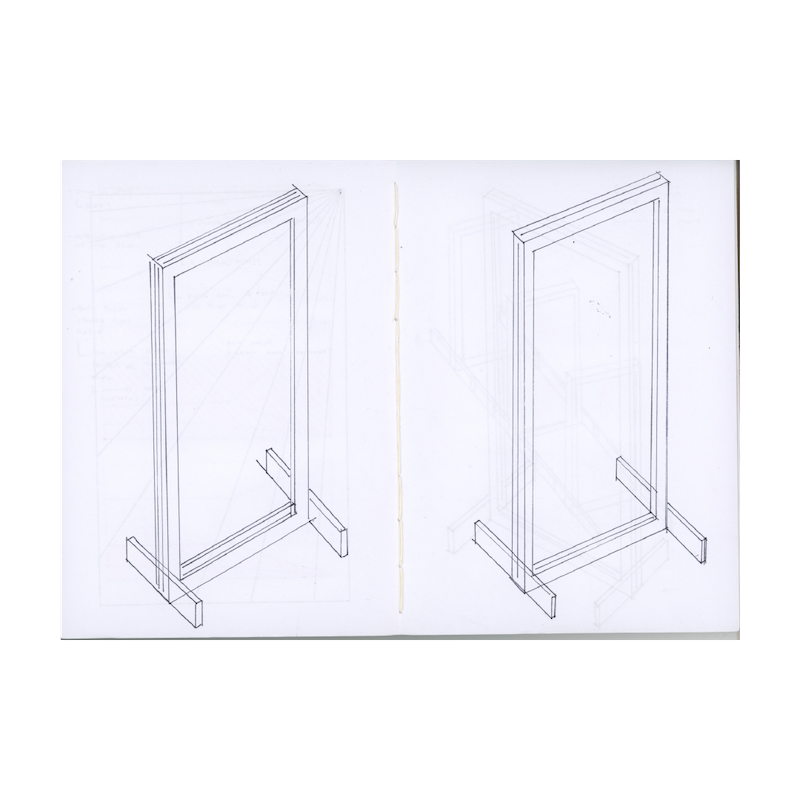
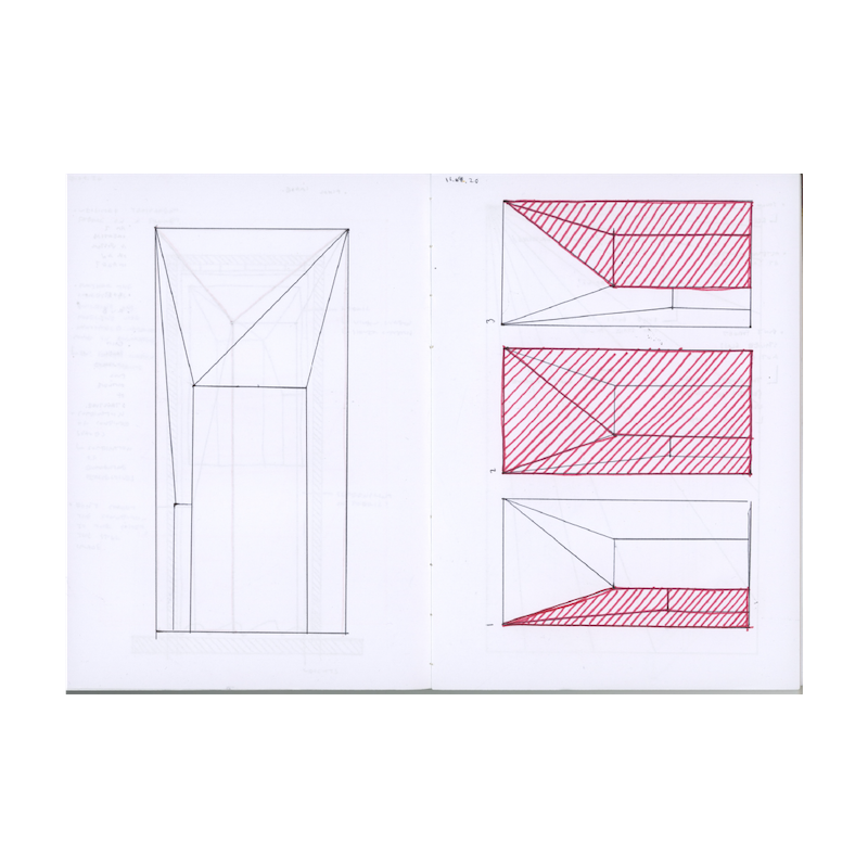
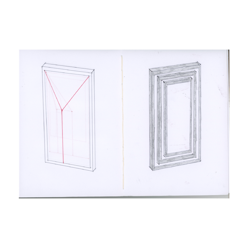
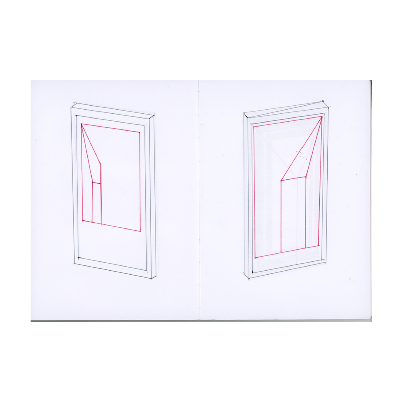
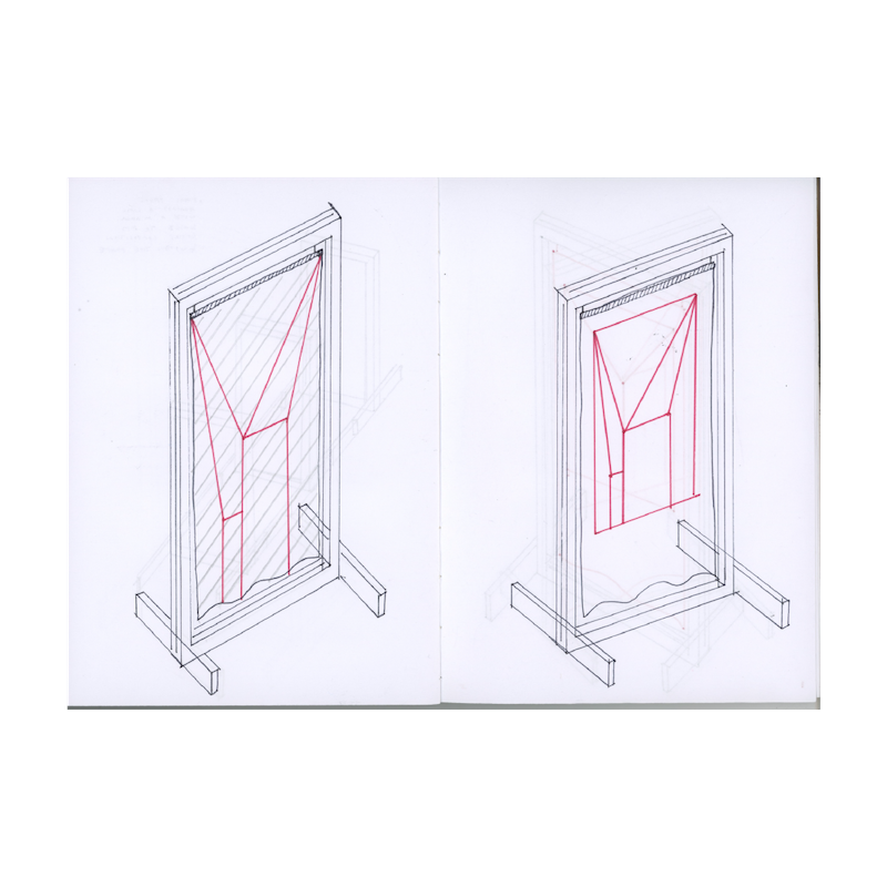
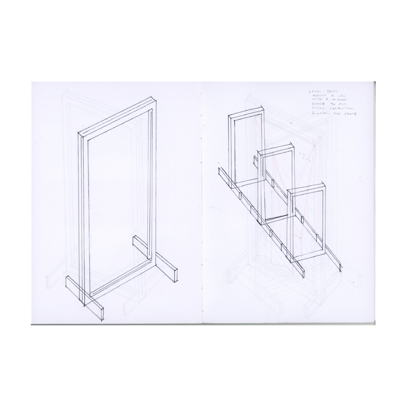
RESEARCH
This project is a reflection of restrictions in space during the initial lockdowns brought on by the COVID 19 pandemic. What does it mean to find freedom in a time where freedom is confined for the greater good? What does freedom look like in COVID 19 times?
The study of the relationship between open and confined space, 2D and 3D space, and the conversations bewteen these elements take the form of many outputs, sketches if you will. Even the final product, the three panels in physical space, exists as a sketch.
#research #freedom #perspectives #constraints

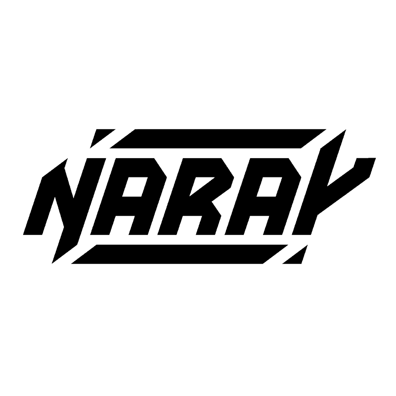
IDENTITY
NARAY is a DJ and creative based in Los Angeles, CA.
NARAYMUSIC.COM
#logo #logodesign #systematic_design #identity #branding

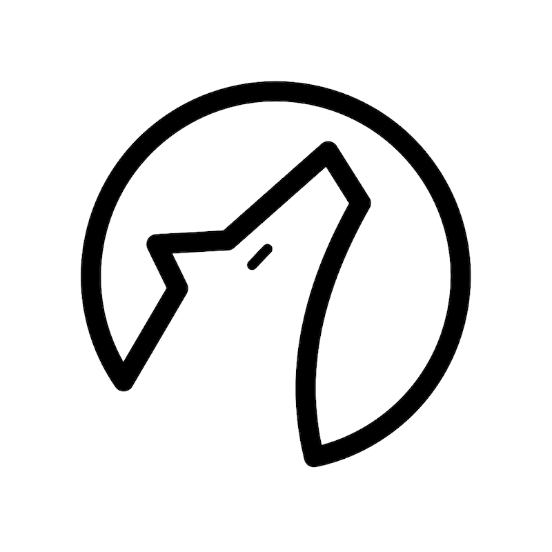
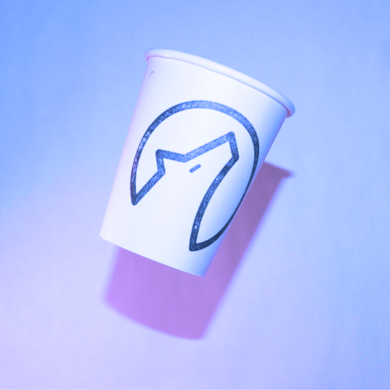
IDENTITY
iL Lupo (the wolf) is a Mississippi based premiere coffee shop, serving under the Italian tradition of fine coffee, and the influence of Mississippi Blues champion, Howlin’ Wolf.
#logo #logodesign #systematic_design #identity #branding


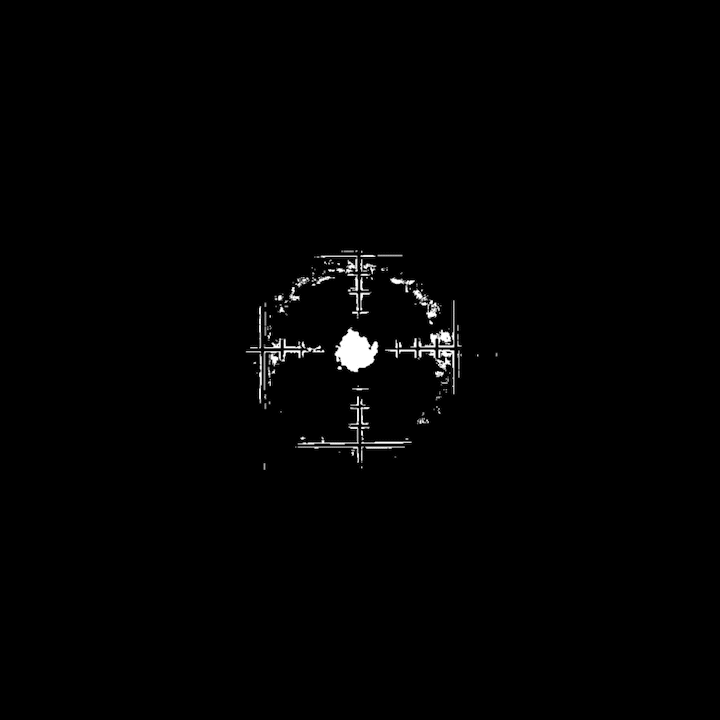
KEY_VISUAL
This infographic poster responds to the mass shooting in Las Vegas in October of 2017, and acts as a template for mass shooting awareness posters.
#keyvisual #poster #activism #guncontrol

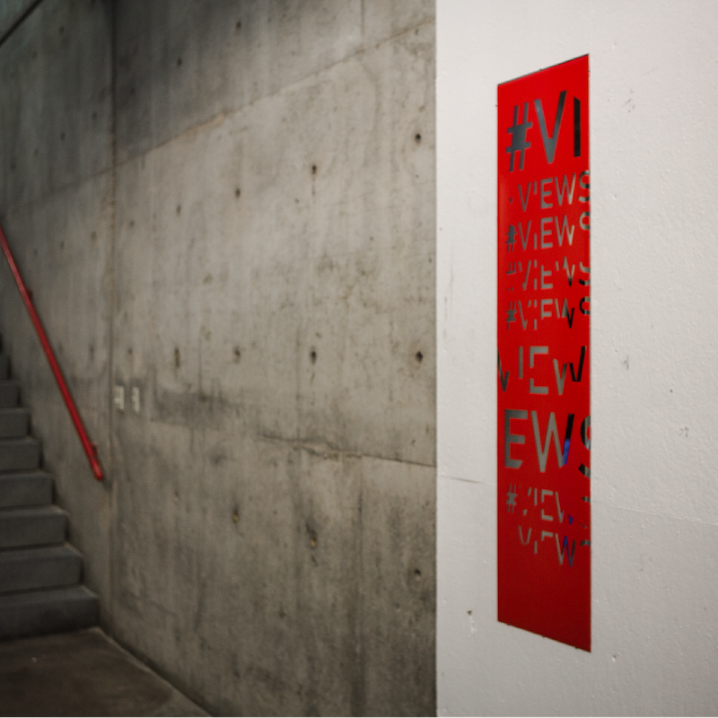
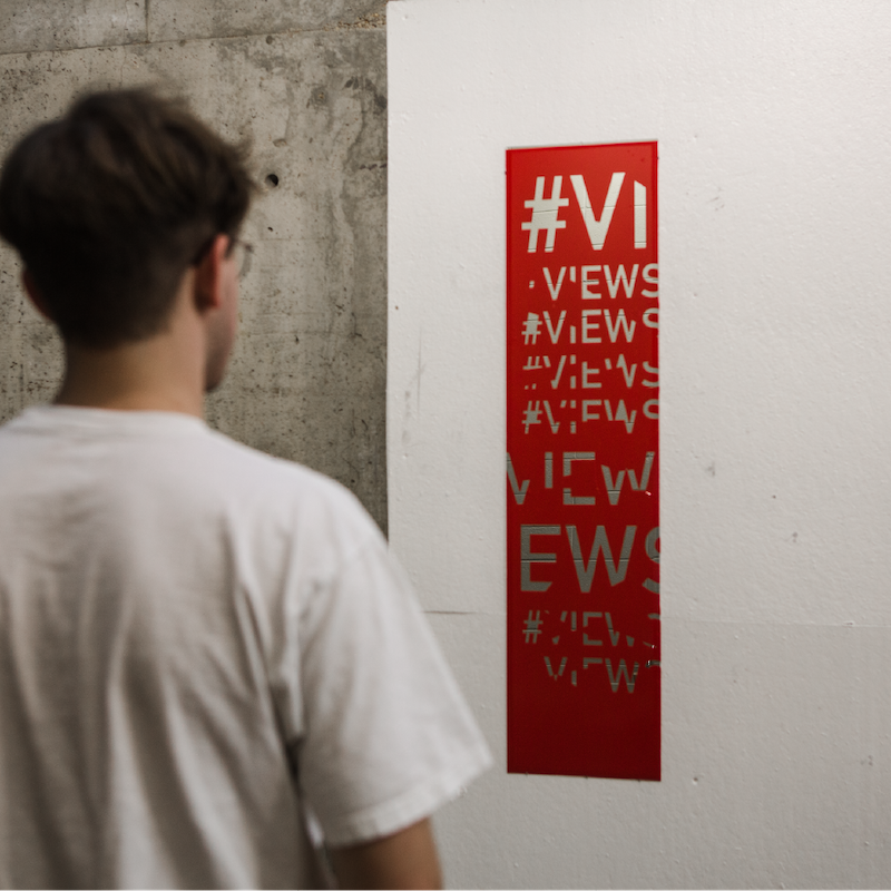
KEY VISUAL
The VIEWS poster asks the onlooker to review themselves, break their image down, and rebuild themselves anew.
This poster was featured as a finalist in the 2016 Skopje International Poster Competition.
#keyvisual #poster #views